2025
BRISH
PROJECT DELIVERABLES
• Graphic Design
• Product Design
• Packaging Design
• Branding
• Logo Design
PROJECT TOOLS
• Illustrator
• Photoshop
• InDesign
MY ROLE
• Named the Brand and Developed it’s Visual Identity
• Designed Logo, Die-lines, and Packaging Systems
• Created Custom Eco-iconography and Info Layout
• Ensured Consistency Across Brand, Product, and Print
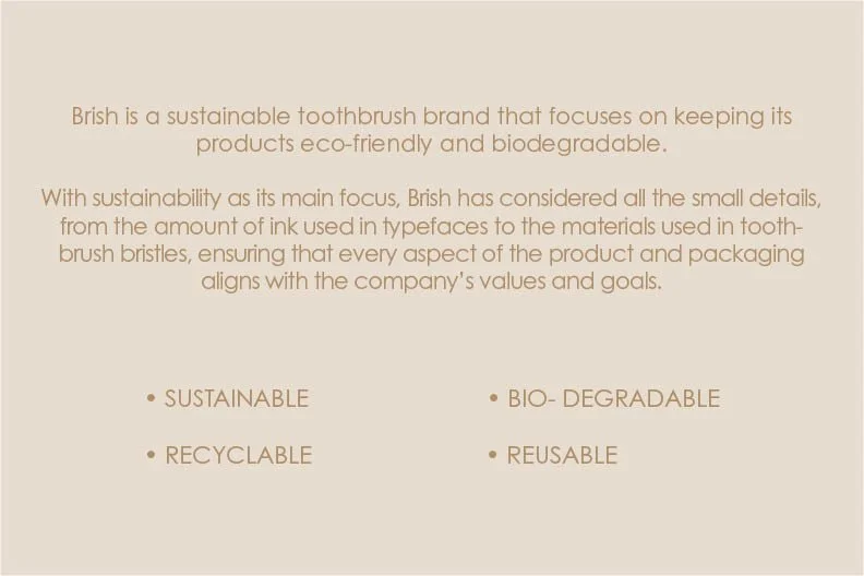
Brish is an eco-conscious toothbrush brand designed for those who care about their teeth and the planet. Focused on sustainability and biodegradability, Brish blends thoughtful design with environmental responsibility. This project placed branding and identity at the heart of every creative decision—from the logo and packaging to product materials and even the choice of ink. Every element was crafted to reflect Brish’s personality and purpose: gentle on you, and gentler on the Earth.
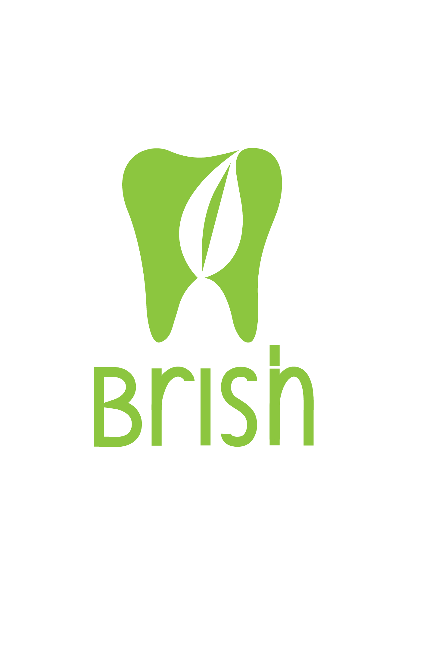
Brish was a project where I really wanted the branding to reflect the values behind the product—clean, thoughtful, and environmentally conscious. The brand’s logo design was created keeping these values and goals in mind.
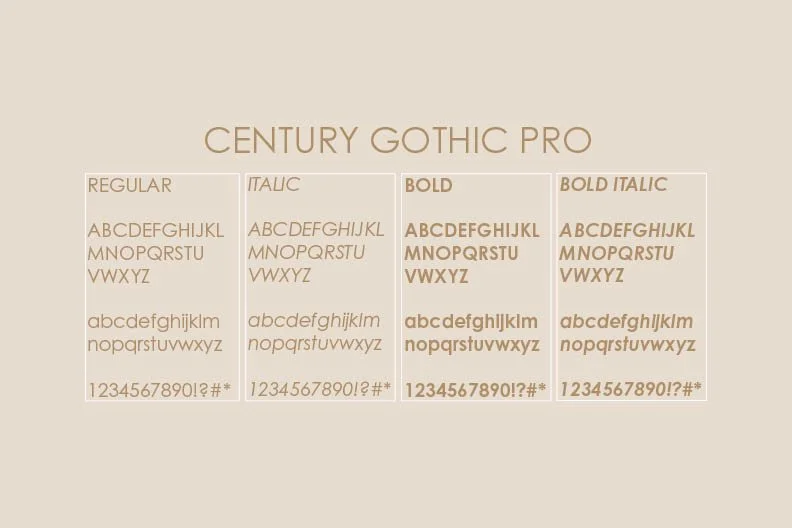
I chose Century Gothic Pro for its clean and minimal lines, but also because its thin stroke weight uses less ink—something that aligned with the brand’s low-waste approach. To take that further, I used soy-based ink made from renewable soybeans and natural resins, which is easier to recycle and better for the environment.
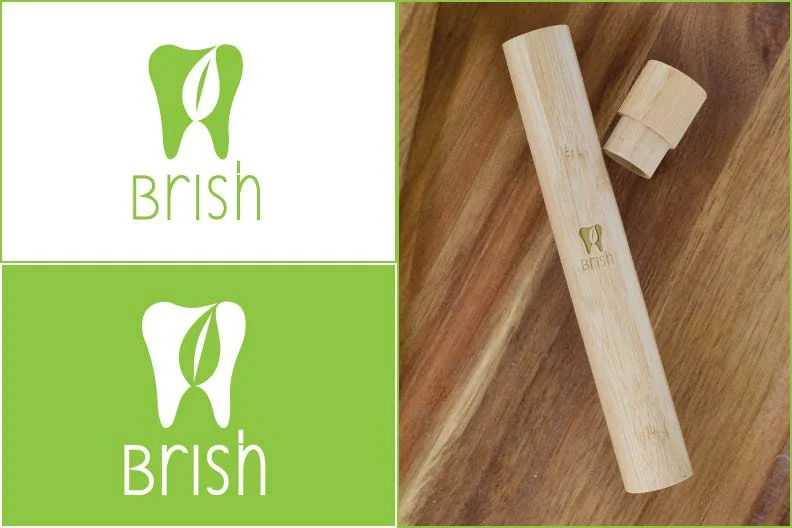
The logo itself is simple: a monochromatic outline of a tooth. But within that shape, the negative space forms a leaf—bringing together the ideas of dental care and sustainability in a subtle, intentional way. It’s not flashy, but it carries the core message of the brand in a way that feels honest and clear.

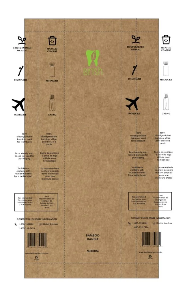

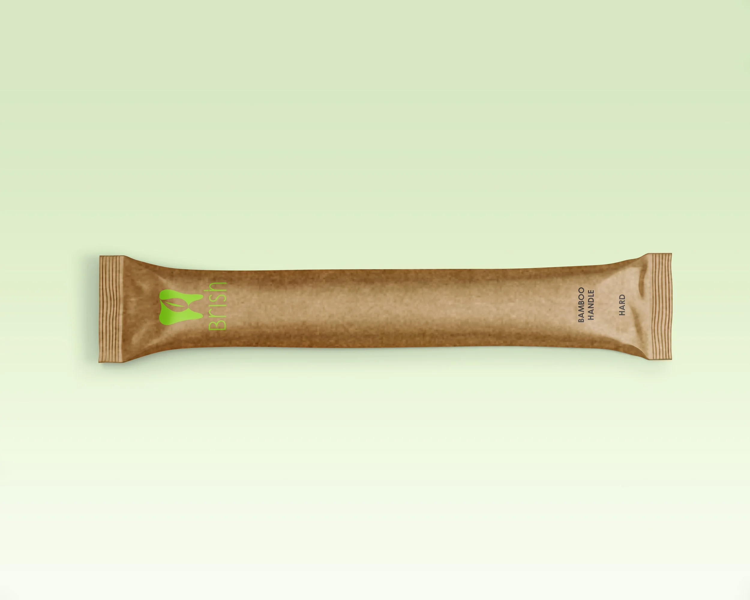
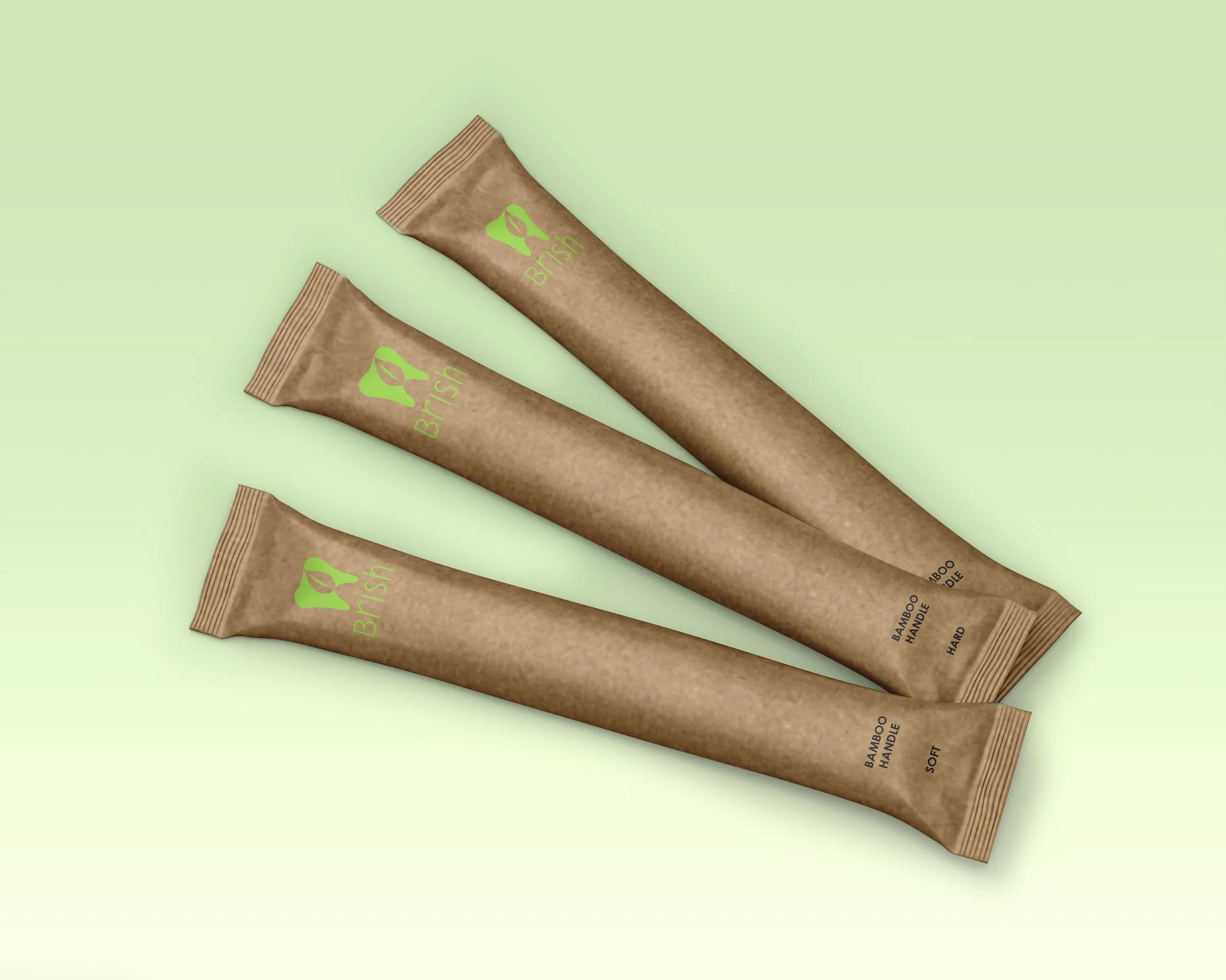
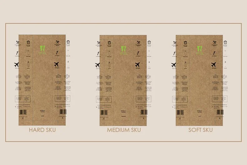
Brish Dieline Designs
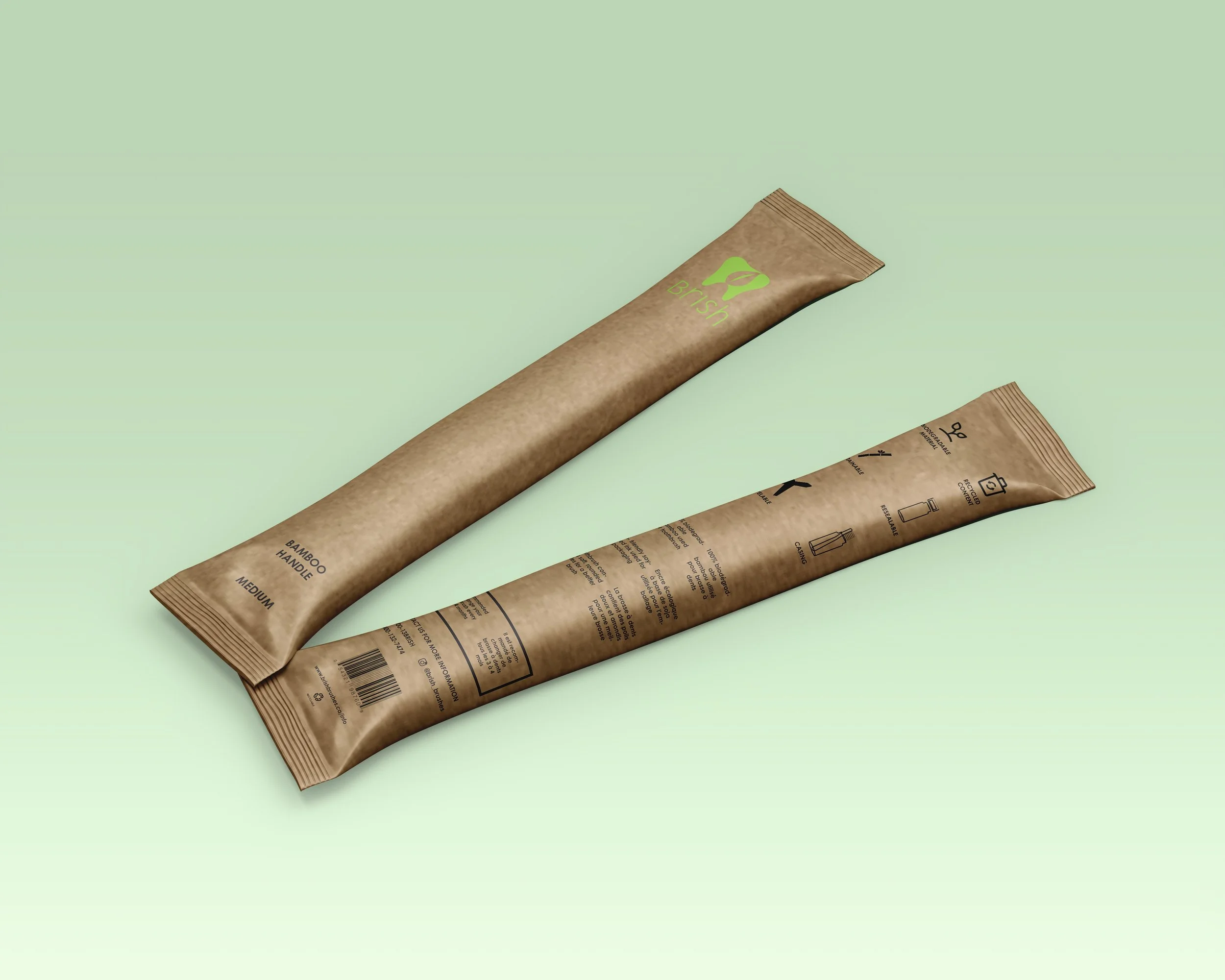
Brish’s packaging was designed with care and intention. Each dieline supports a different brush type—soft, medium, or hard—and is made from kraft paper printed with soy-based ink, so it’s safe to recycle and compost. The optional bamboo case adds a simple touch of function, doubling as a travel holder with a resealable lid. Every detail was shaped by the idea that packaging should feel thoughtful, not throwaway.
DIELINES –
Custom dielines for every product variation ensured consistency during production while enhancing user understanding through
visual hierarchy.

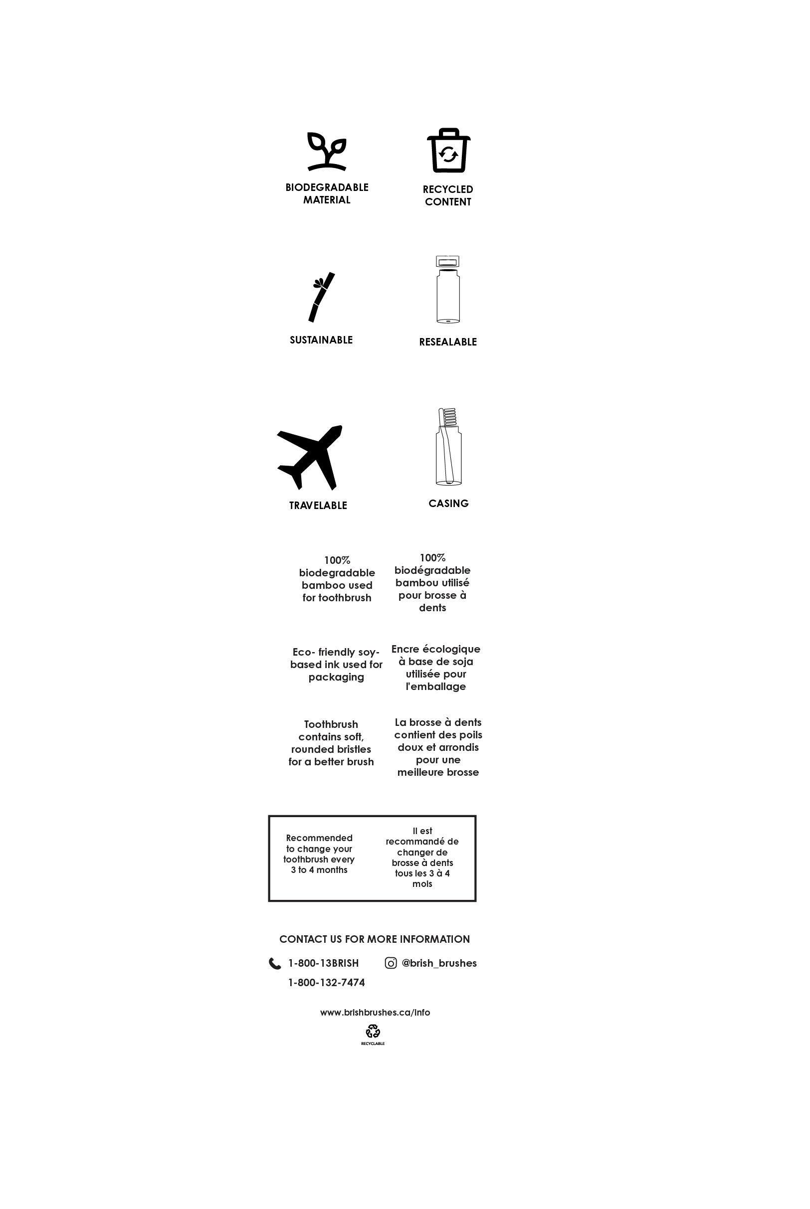
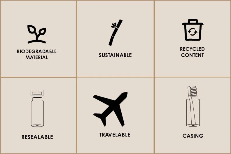
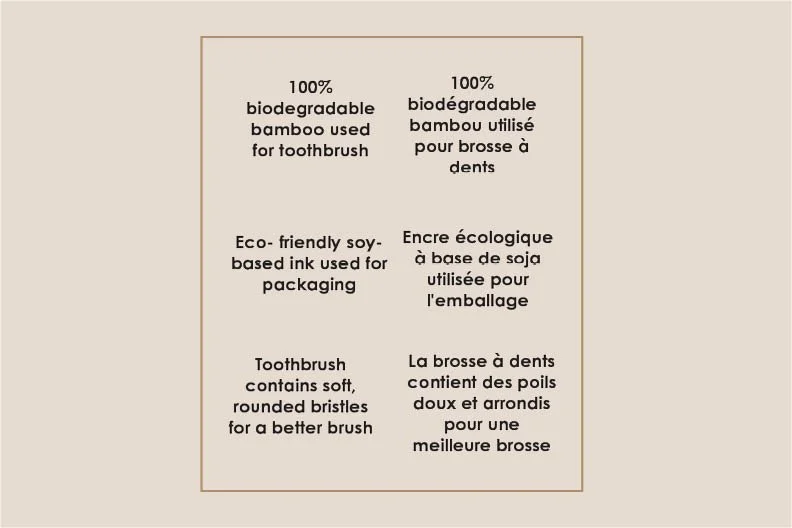
The icon system on Brish’s packaging was created to make sustainability feel approachable and easy to understand. Each symbol points to a key feature—like biodegradable materials, travel-friendly design, or a resealable lid—offering a quick, friendly way to connect with the product’s values. Just below, a few lines of supporting text go deeper: the brush is made from 100% biodegradable bamboo, printed with soy-based ink, and finished with soft, bio-based bristles made from castor oil and charcoal. Nothing is extra. Everything is intentional. It’s design that feels good—visually and ethically.
ICON SYSTEM —
An approachable, easy-to-scan icon system distills complex values into universal symbols, ideal for communicating at-a-glance in retail and travel spaces.
PACKAGING TUBES —
Each kraft tube uses biodegradable materials and colour-coded printing to distinguish brush type (soft, medium, hard), offering a low-waste, travel-friendly design.
Brand Guidelines
-
![]()
Product Features
-
![]()
Sustainability
-
![]()
Values + Goals
-
![]()
Logo Design
-
![]()
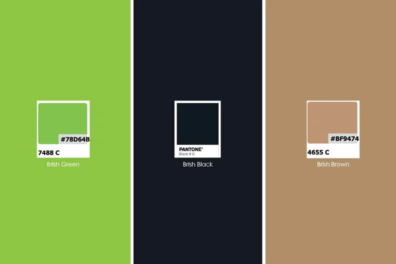
Colour
-
![]()
Typeface
-
![]()
Dieline

This project taught me how to balance visual storytelling with production constraints, from dieline accuracy to icon readability — while staying true to a brand’s purpose.