
FRANKENSTEIN
RE-DESIGN

• Illustrator
• InDesign
• Photoshop
PROJECT TOOLS
My Role
• Concept Development
• Layout + Typesetting
• Cover Illustration
• Typography Strategy
• Graphic Design
• Typographic Design
• Cover Design
PROJECT DELIVERABLES
2022
A fresh take on Mary Shelley’s Frankenstein, this redesign pairs the intricate, gothic-inspired typography of the 1818 original with a modern, minimalist touch. The monochromatic palette keeps things clean and atmospheric, letting the tension of the story speak through both type and layout. It’s where classic literature meets quiet, contemporary design.
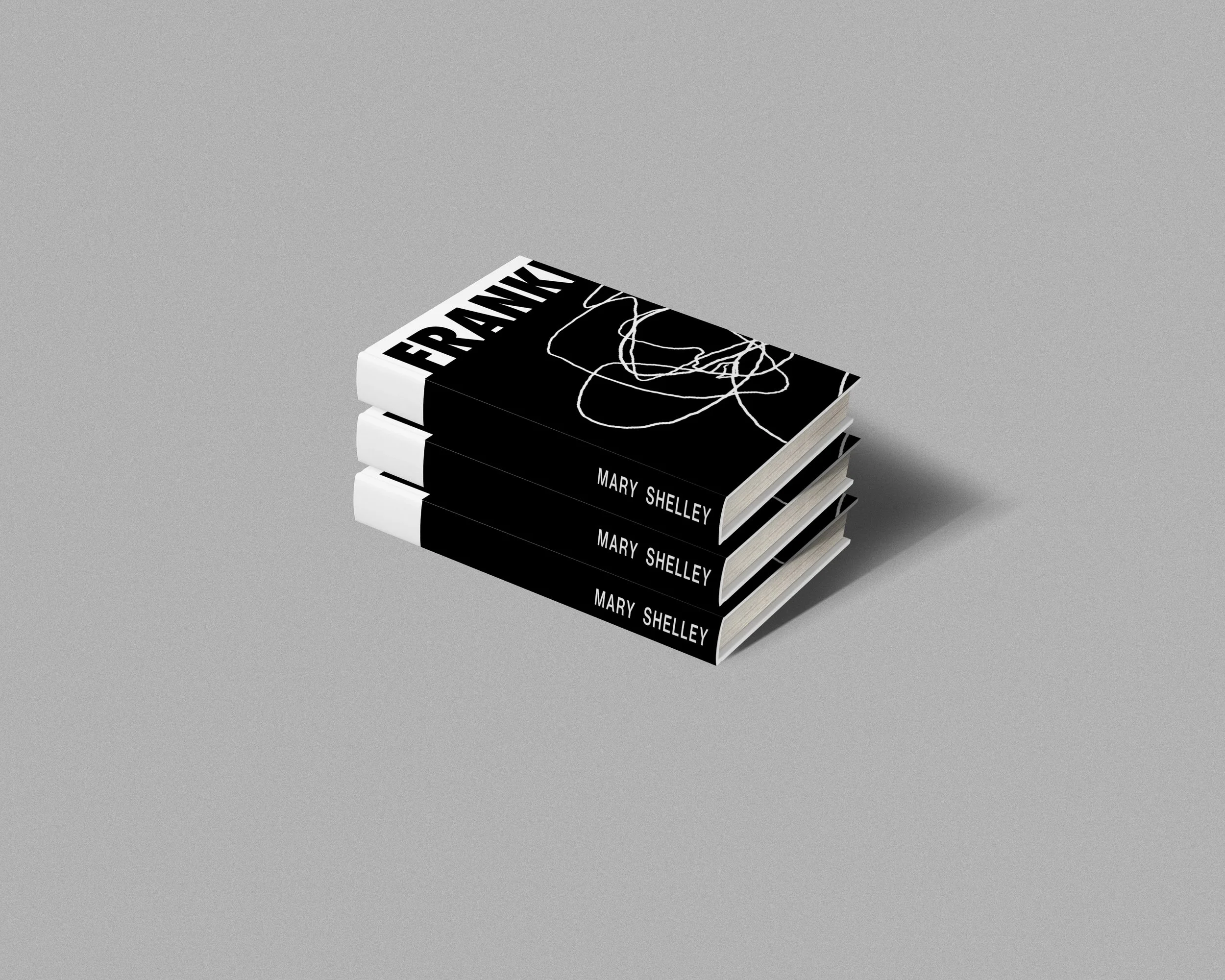
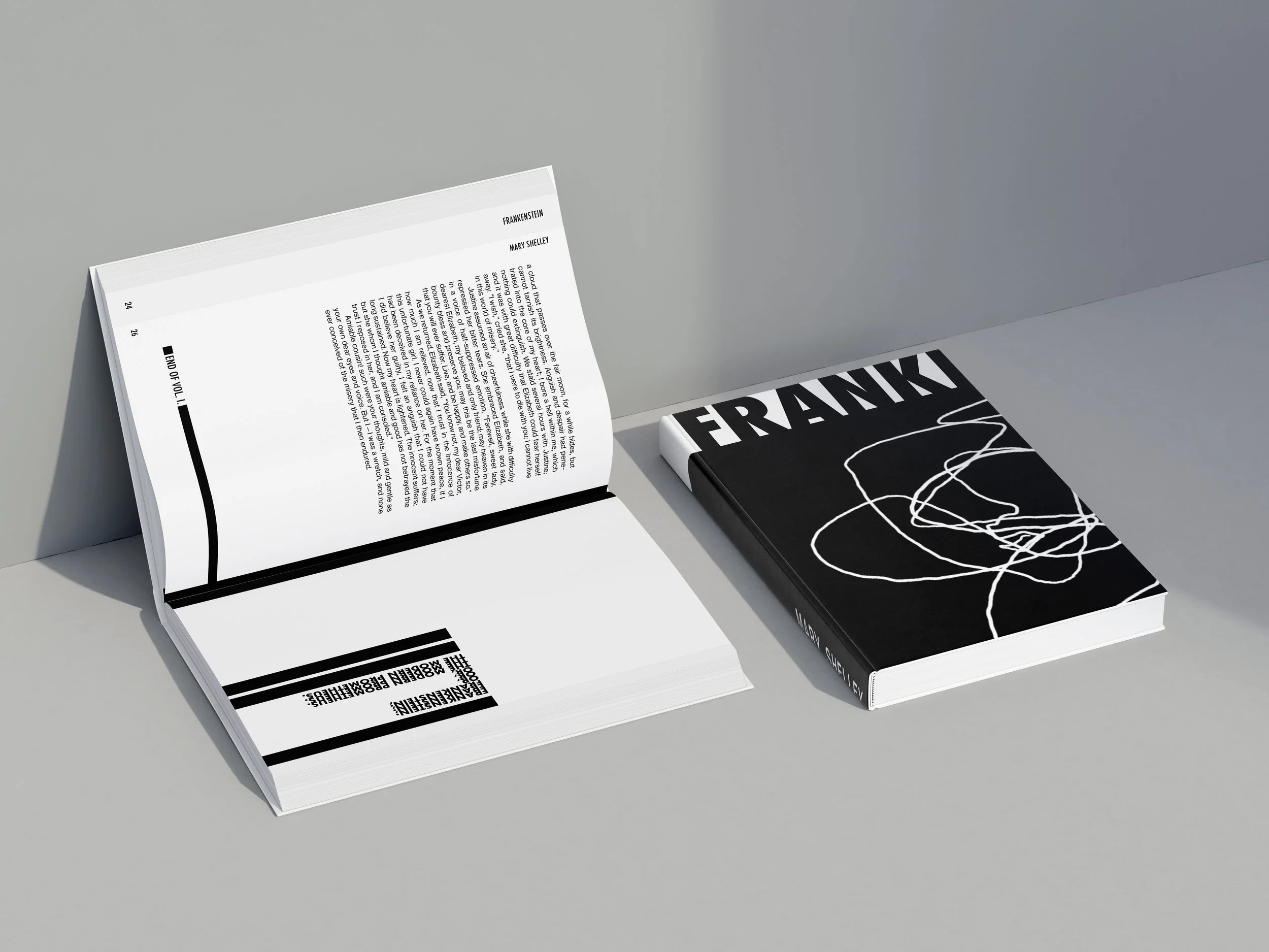
The cover takes inspiration from the way Frankenstein is often described—distorted, uneasy, a little off balance. That energy comes through in the overlapping linework, almost like a controlled scribble, giving the design a sense of tension without feeling chaotic. Sticking to a monochromatic palette helped keep things moody and consistent with the rest of the book’s quiet tone.
The title is split in two—“FRANK” on the front, “ENSTEIN” on the back—as a way to echo the fragmented nature of the character himself. The reversed lettering adds a subtle layer of distortion, hinting at the story’s deeper themes of identity, separation, and what it means to piece something together that was never whole to begin with.
RE- DESIGNED PAGES
-
![]()
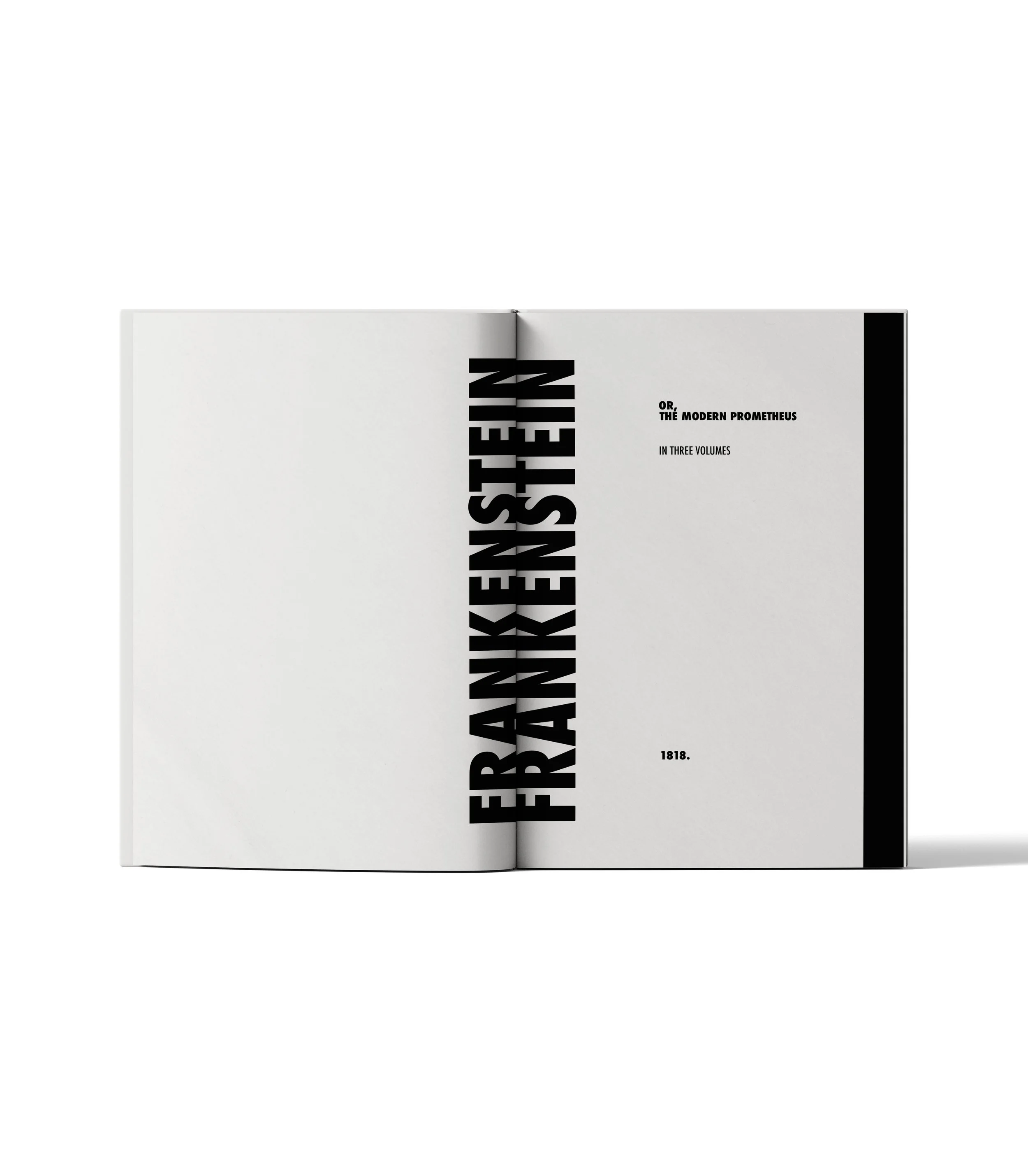
Front Matter
-
![]()
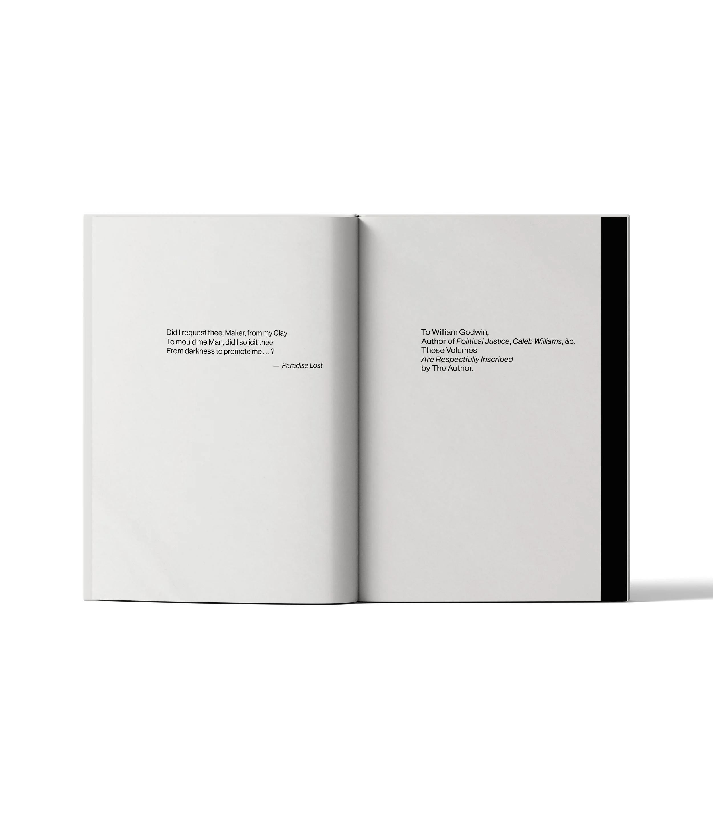
Dedication
-
![]()
Preface
-
![]()
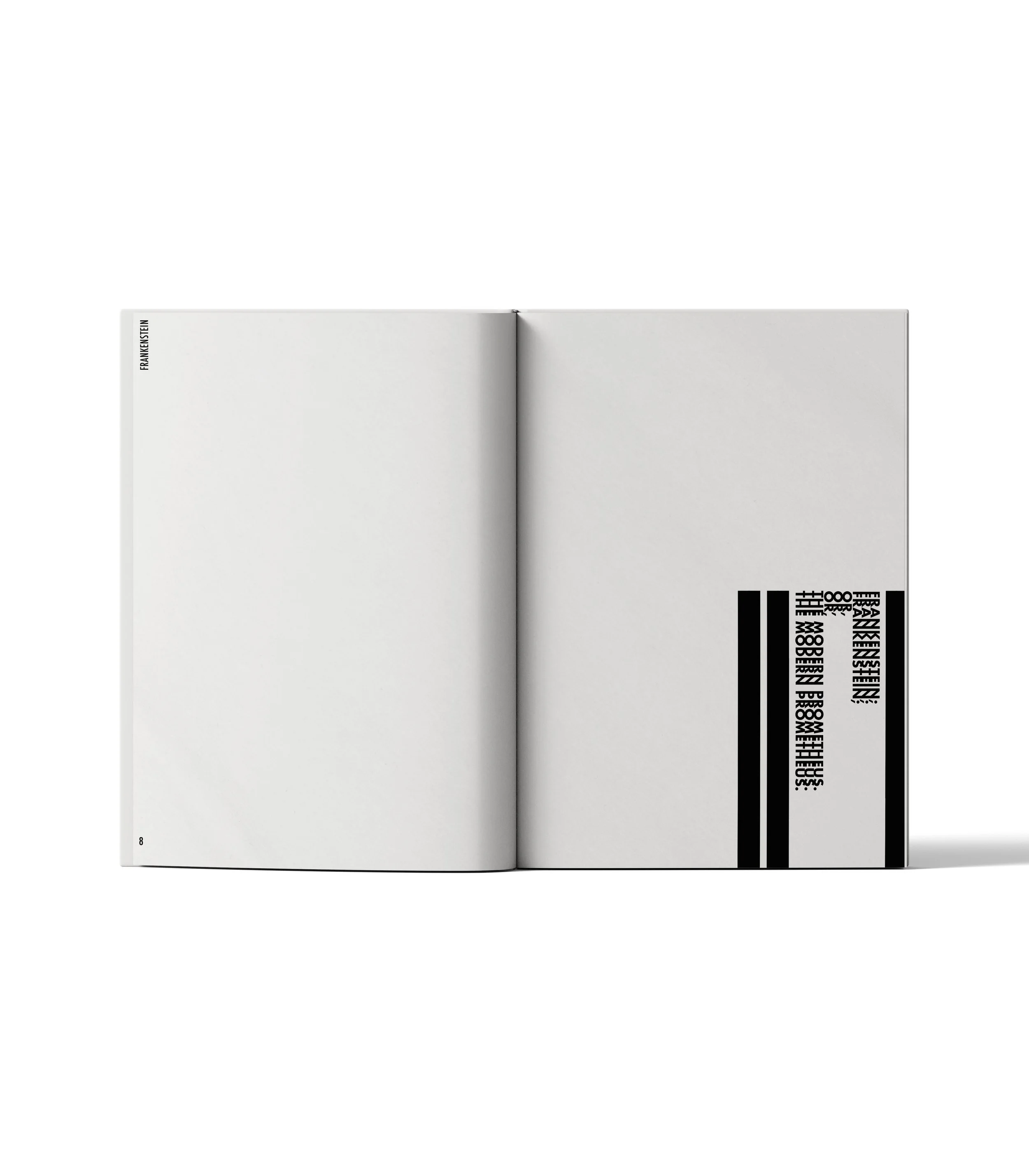
Gap Page
-
![]()
Volume 1 Start
-
![]()
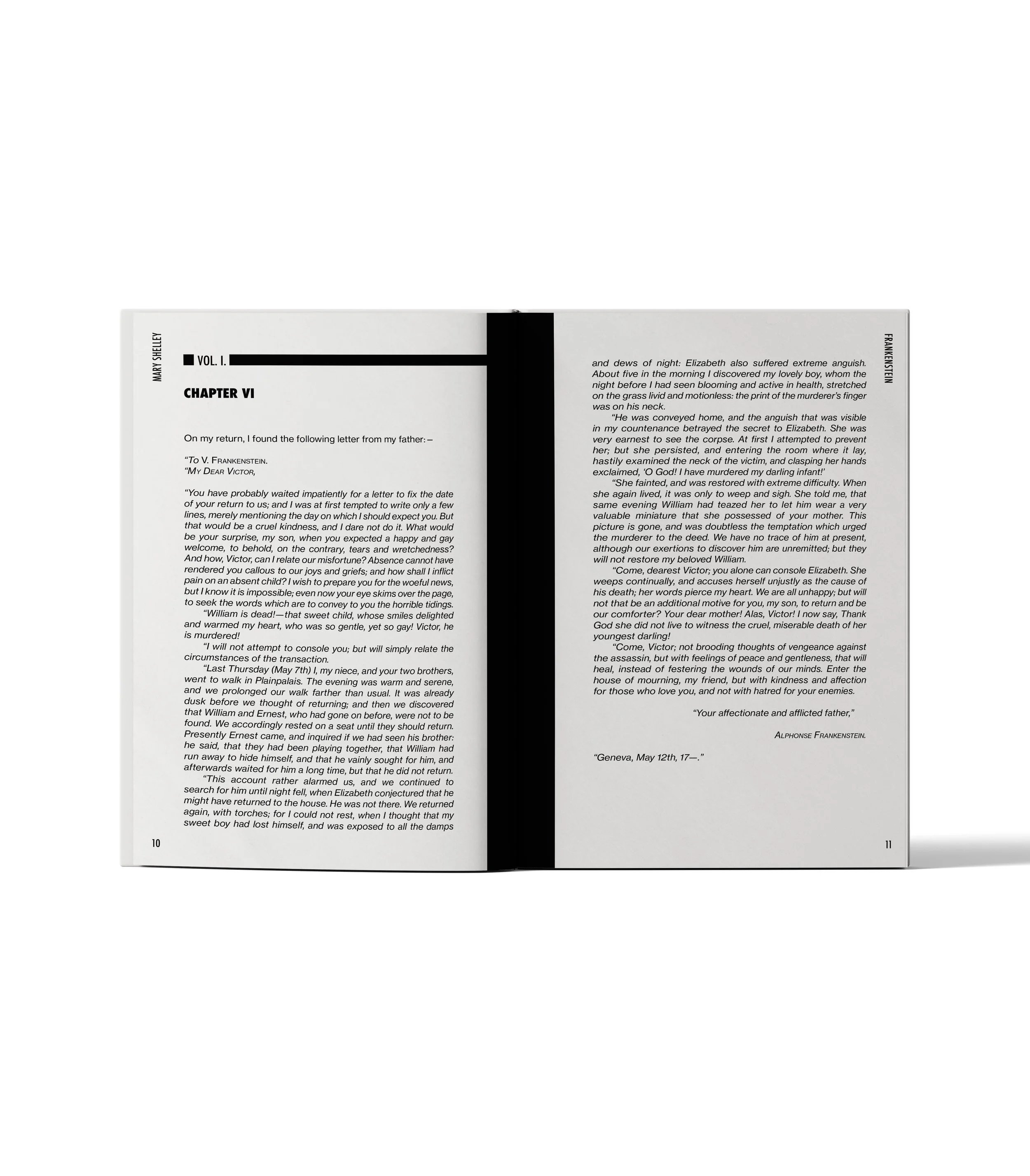
Chapter End
-
![]()
Chapter Start
-
![]()
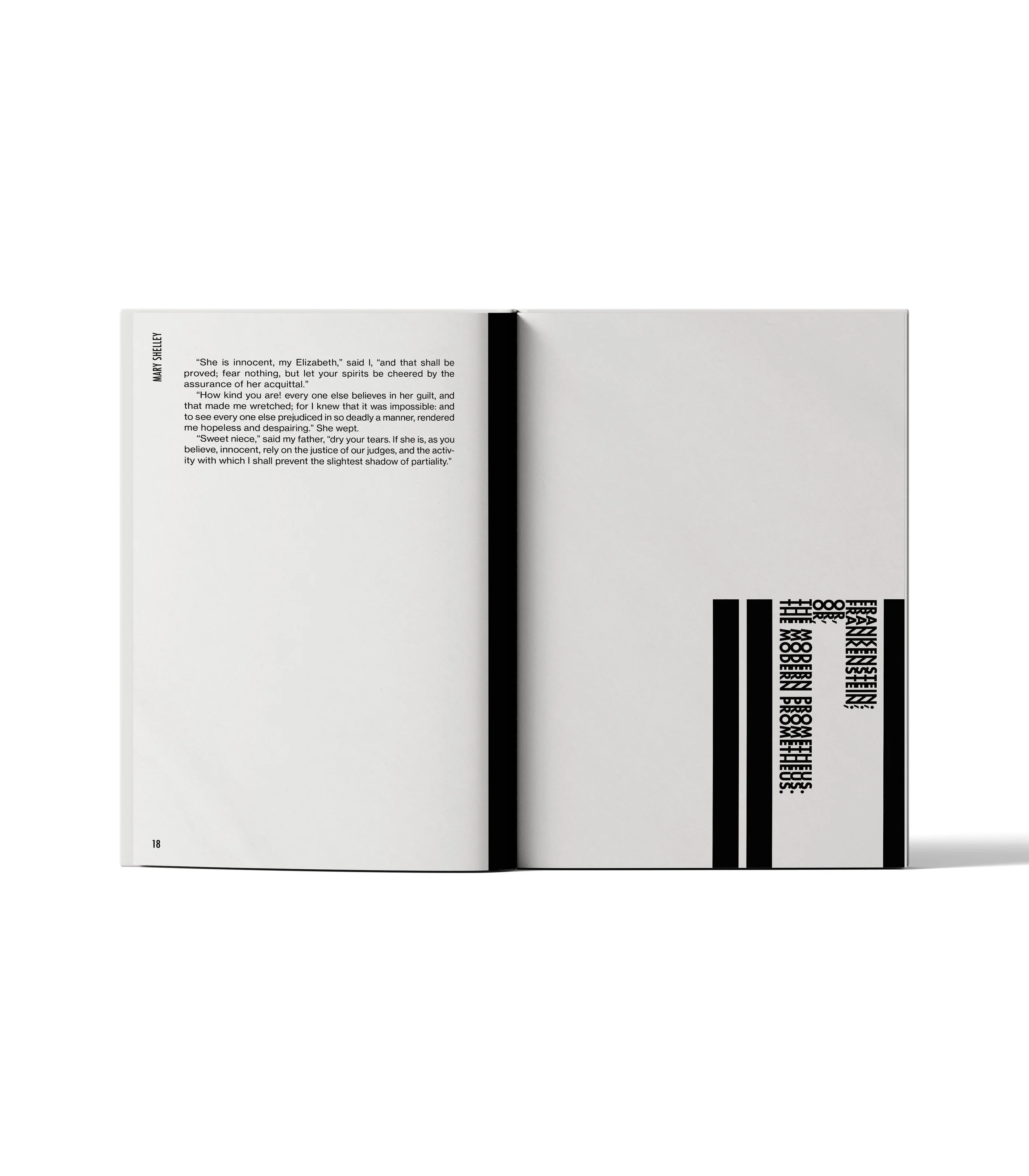
Volume 1 End
-
![]()
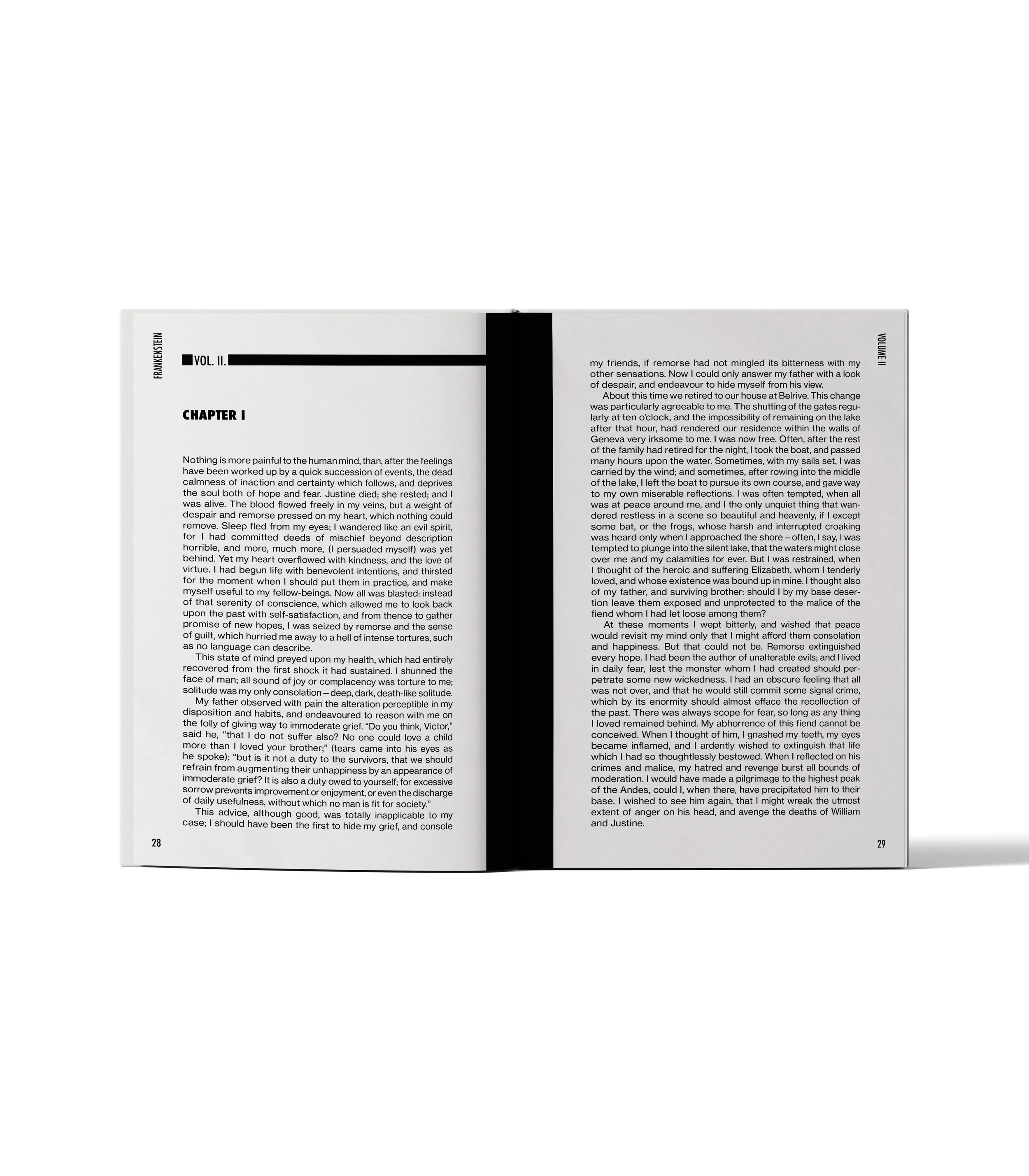
Volume 2 Start
-
![]()
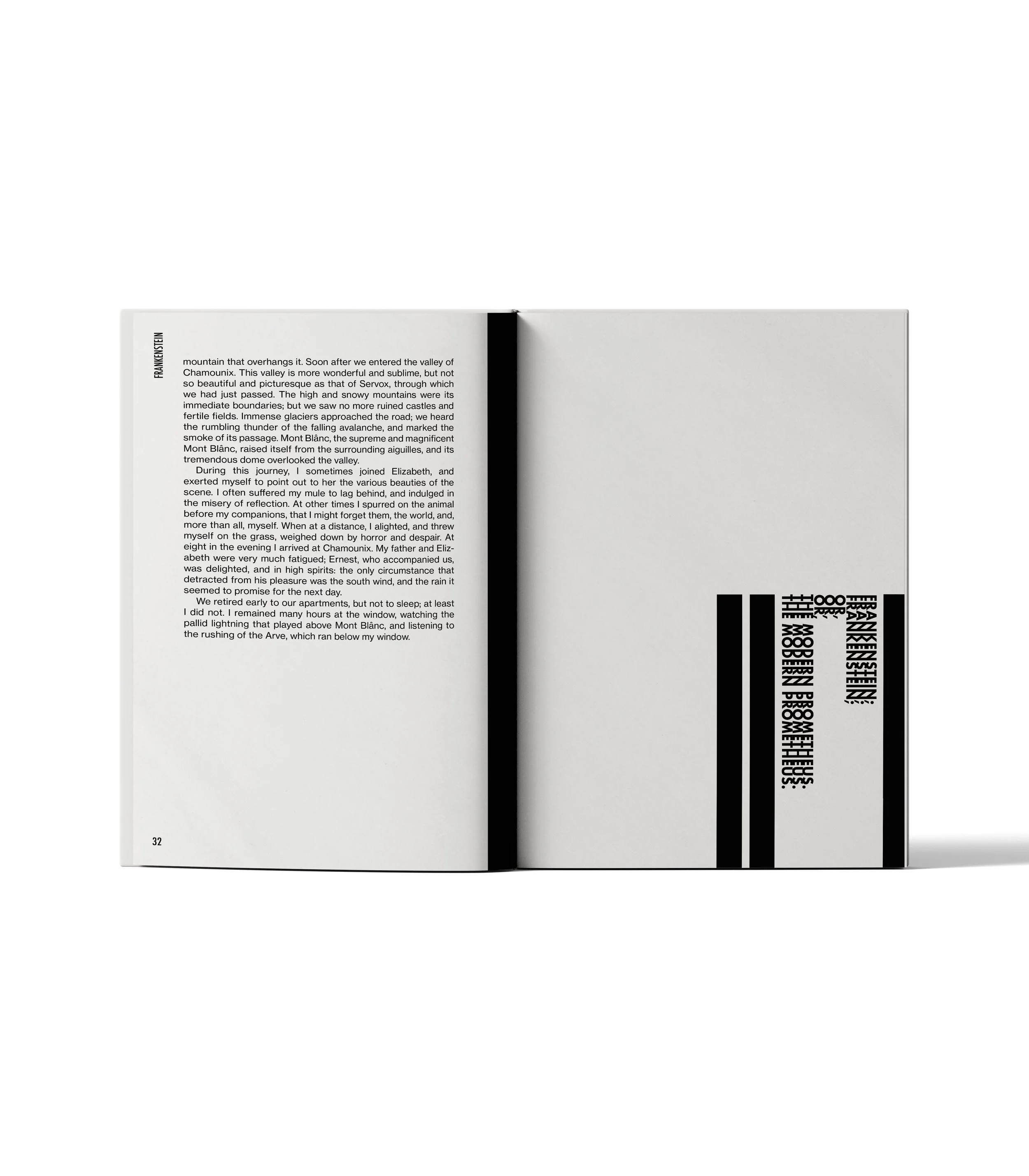
Volume 2 - Chapter End
-
![]()
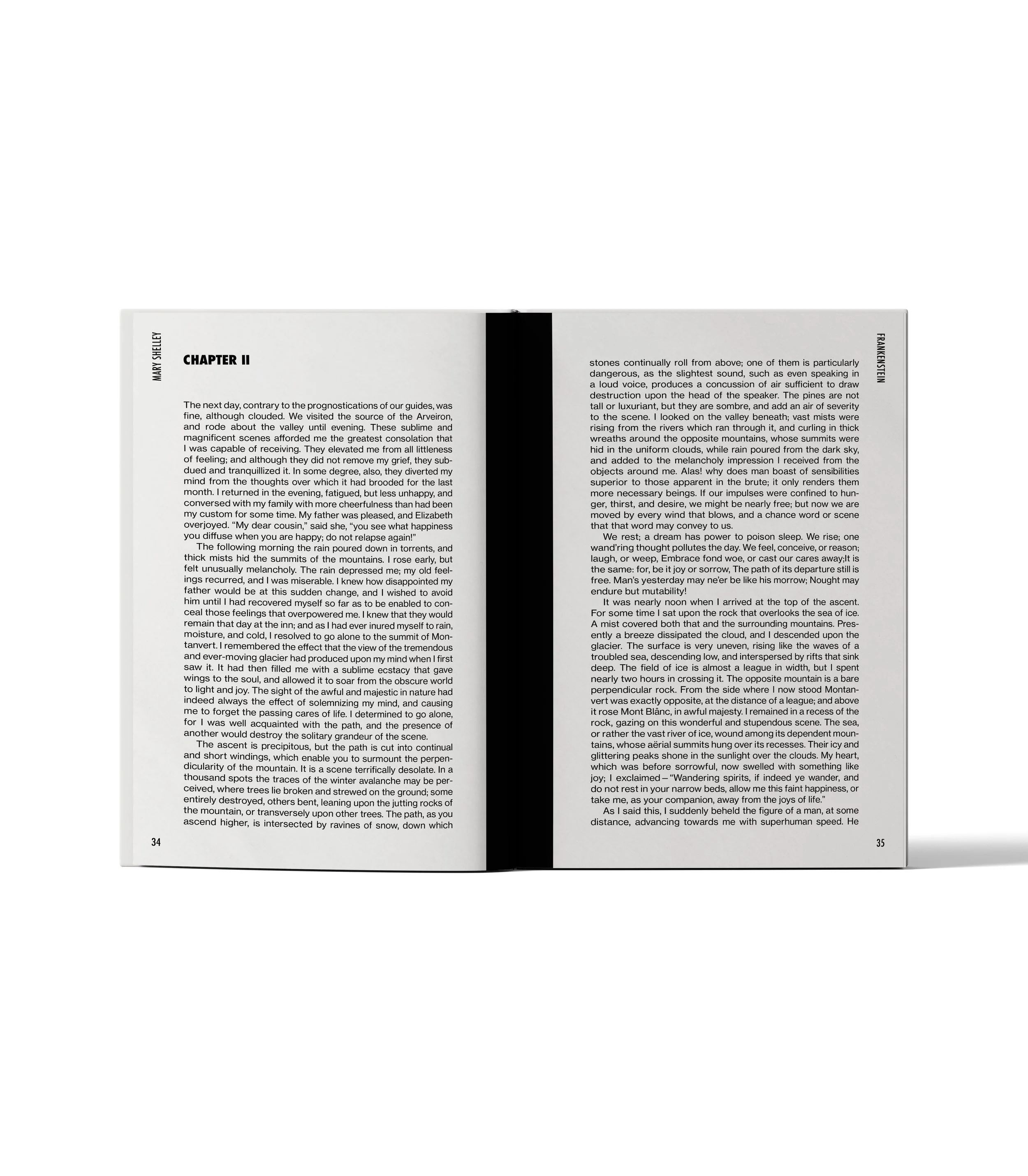
Volume 2 - Chapter Start

This project taught me how to translate abstract themes into design language — a skill I use in brand campaigns, poster design, and even motion assets.