
SCORPIO DESIGN
2025
• Branding
• Graphic Design
• Typography
• Product Design
PROJECT DELIVERABLES
• Logo Design
• Marketing
• Business Cards
• Illustrator
• Photoshop
• InDesign
PROJECT TOOLS
My Role
• Developed Concept and Visual Identity Rooted in Scorpio Mythology
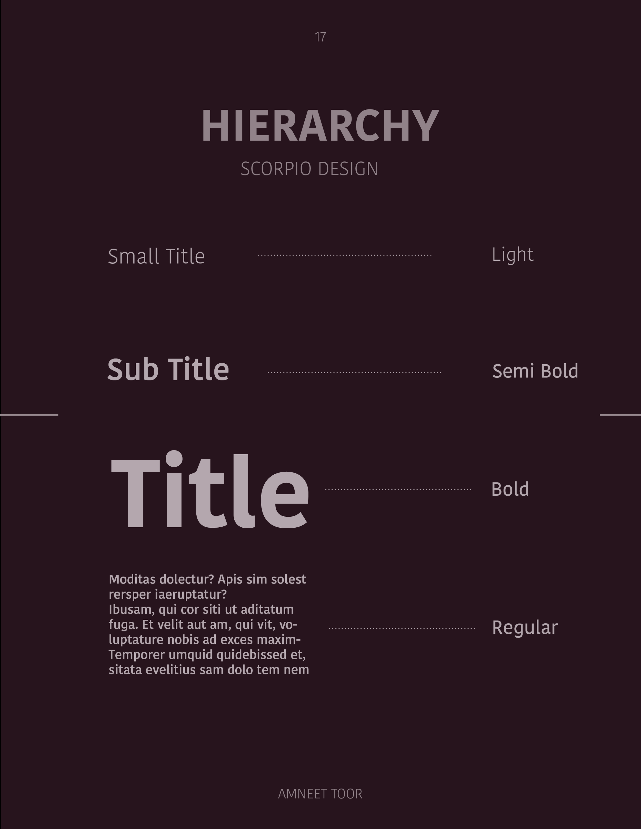
• Design Custom Logo and Typographic System
• Created Stationary System and Product Packaging
• Wrote and Designed Brand Guidelines
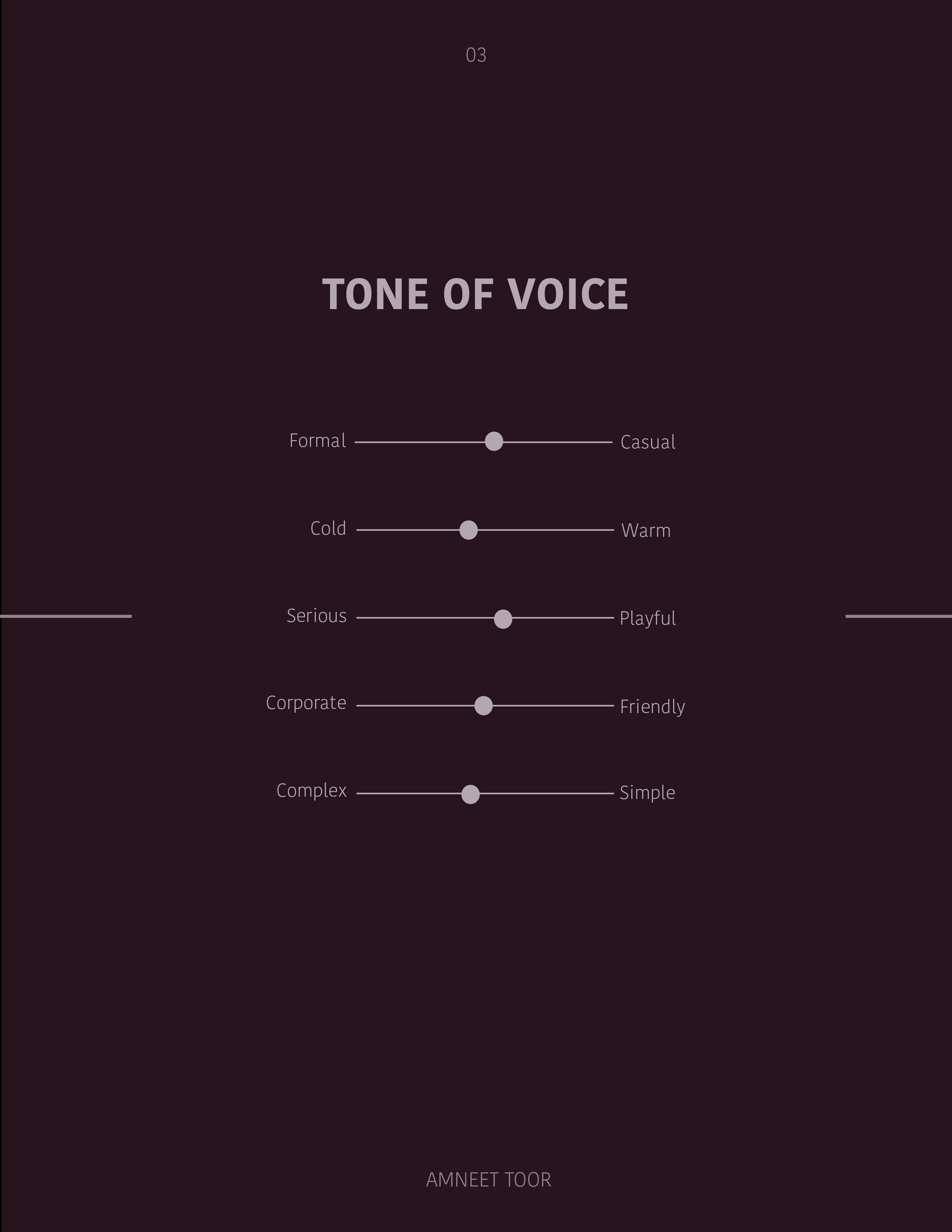
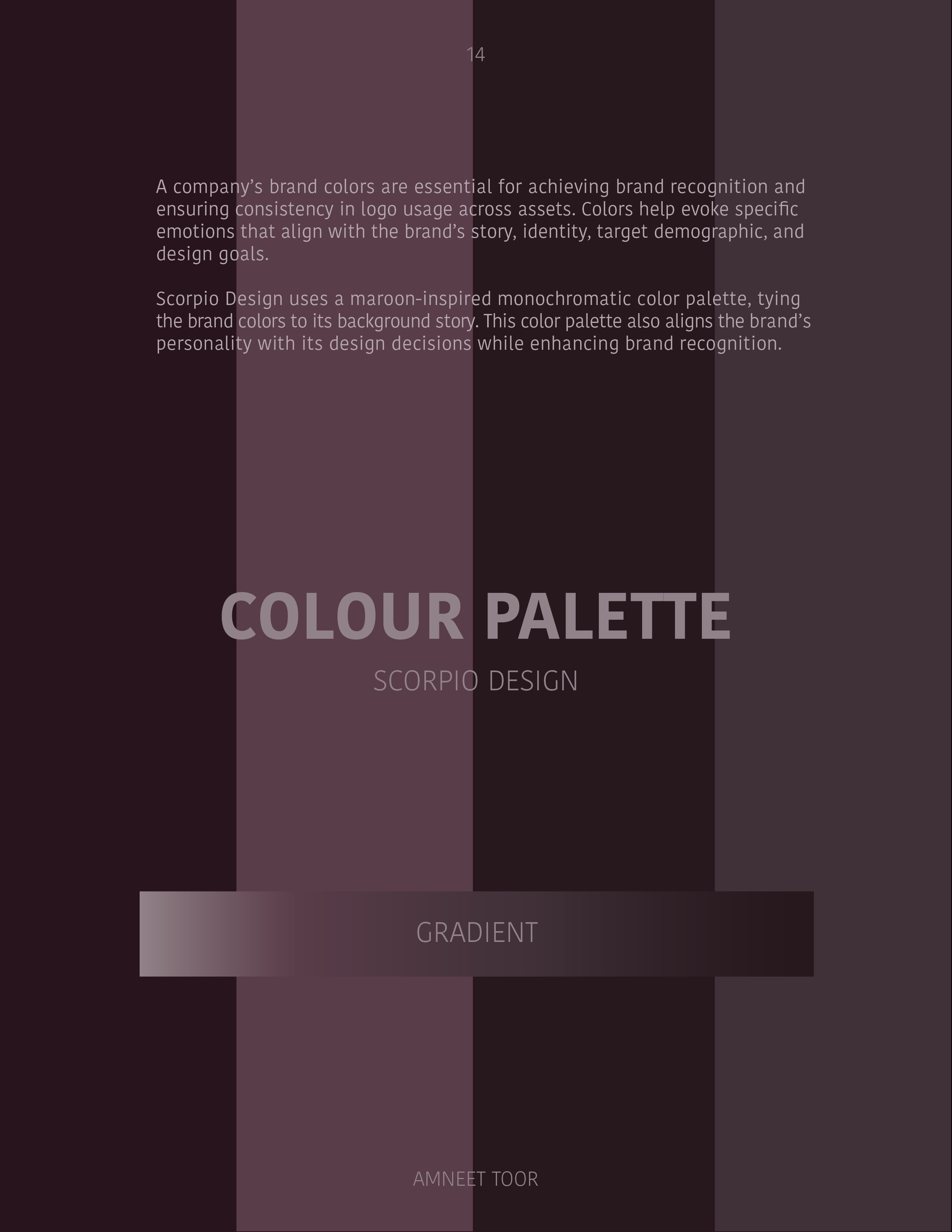
Scorpio Design is a Toronto-based branding project built around the energy of the Scorpio zodiac. I wanted the brand to feel bold and a little mysterious, just like the sign itself, so I leaned into a deep colour palette of maroon, magenta, and purple. Every design choice, from the typography to the symbols, was made to reflect that same magnetic, powerful vibe. The brand was designed to evoke mystery and confidence, appealing to bold, expressive creatives who resonate with Scorpio’s magnetic energy.
Scorpio Design targets creatives who identify with introspection and power, the kind of brand that shows up bold on merch and subtle in professional settings.

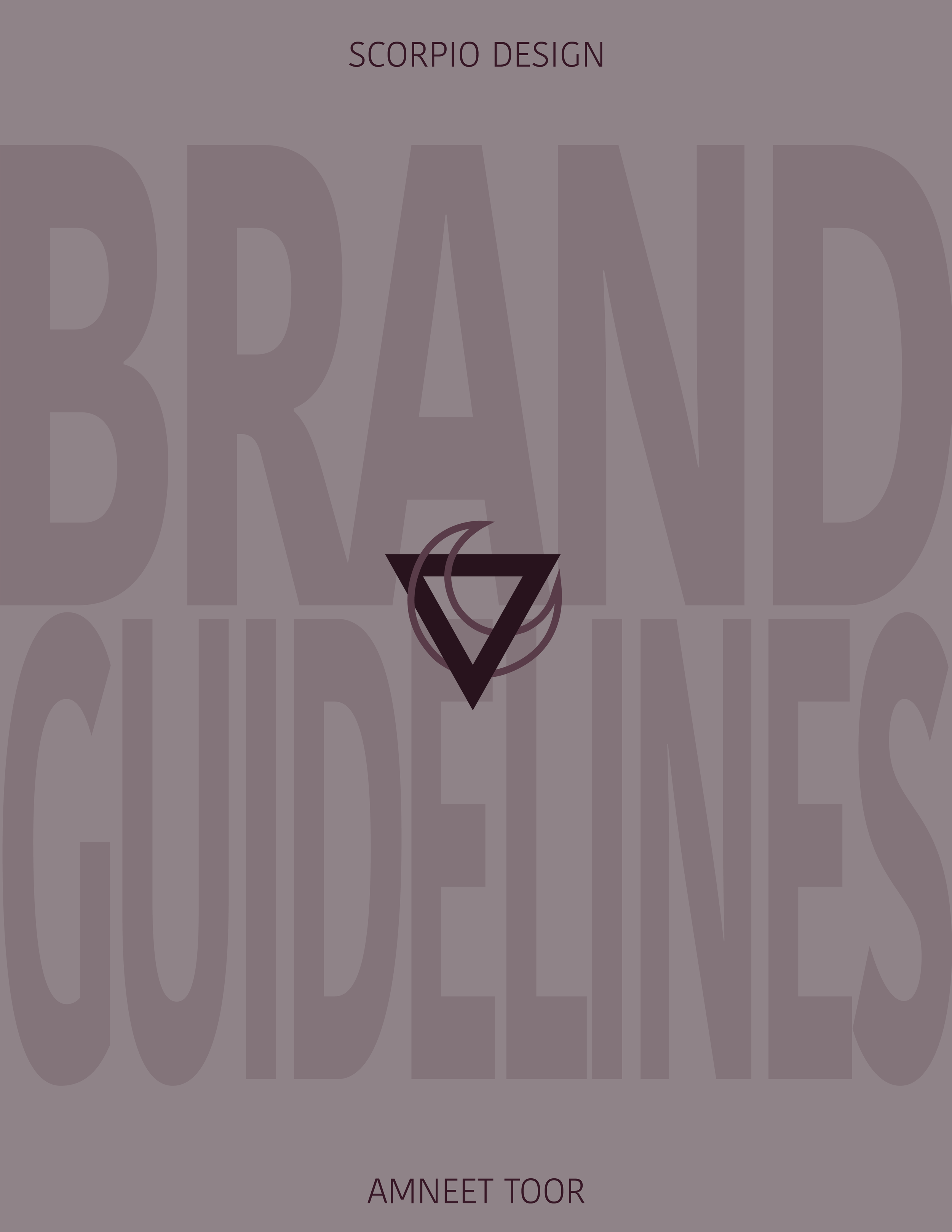
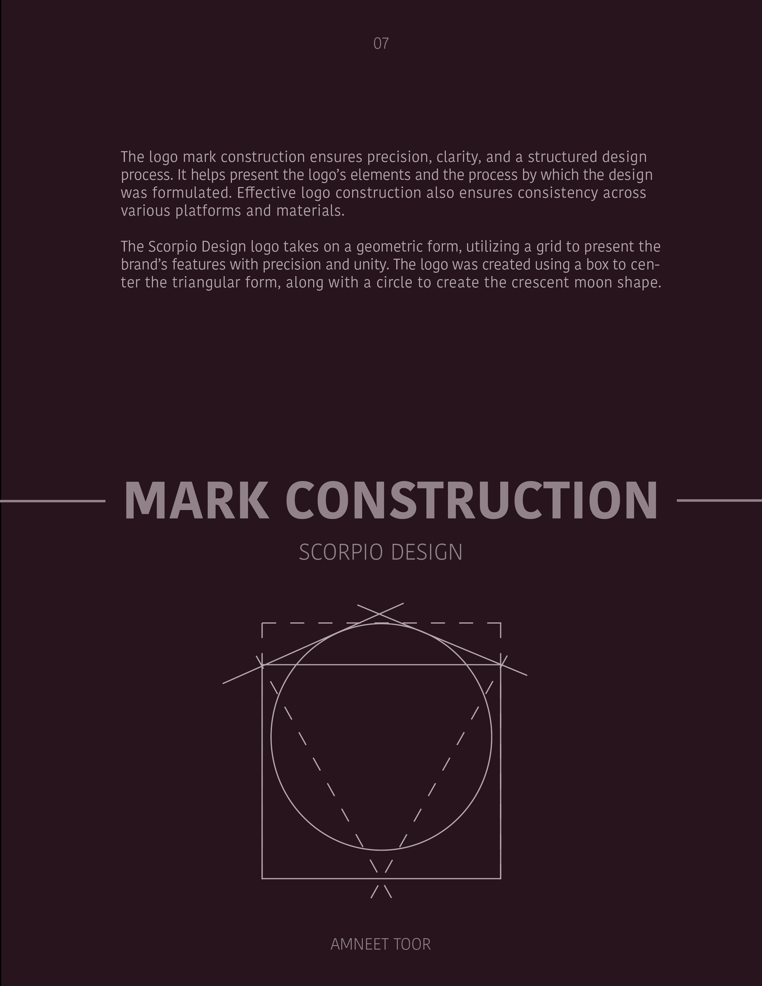
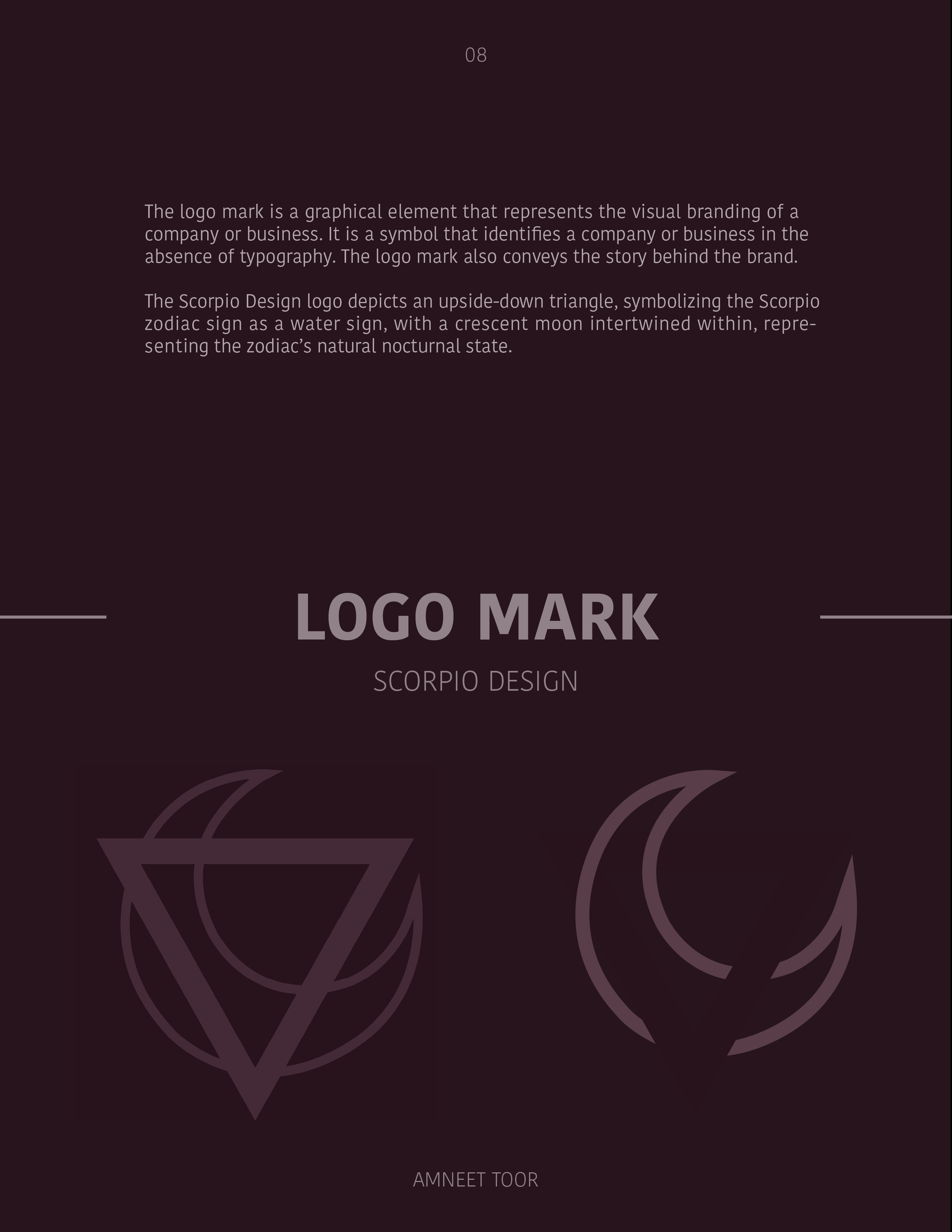
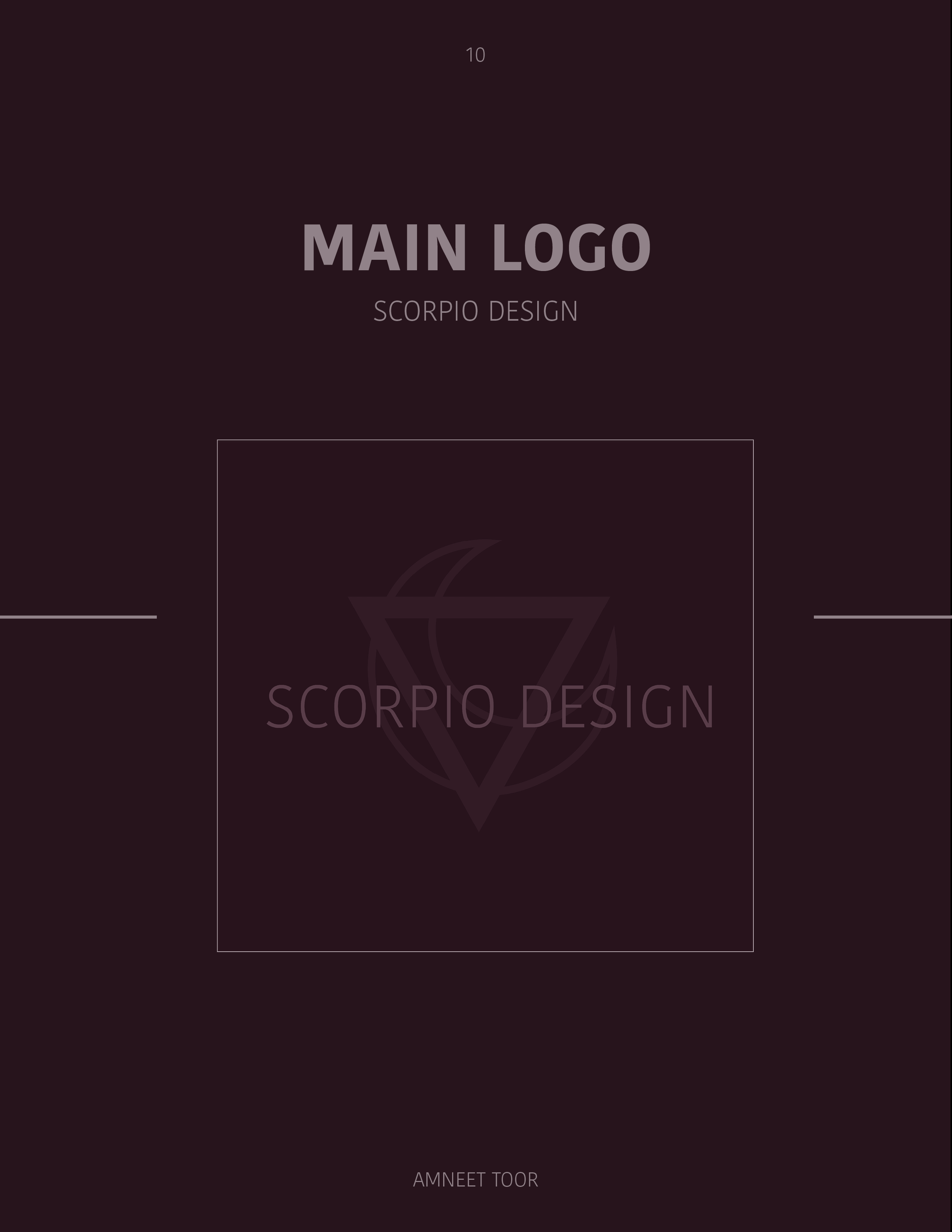
The logo takes inspiration from classic Scorpio symbolism. At its core is an upside-down triangle — a subtle nod to Scorpio’s connection to water — with a crescent moon wrapped through it, reflecting the sign’s deep, intuitive, and nocturnal nature.
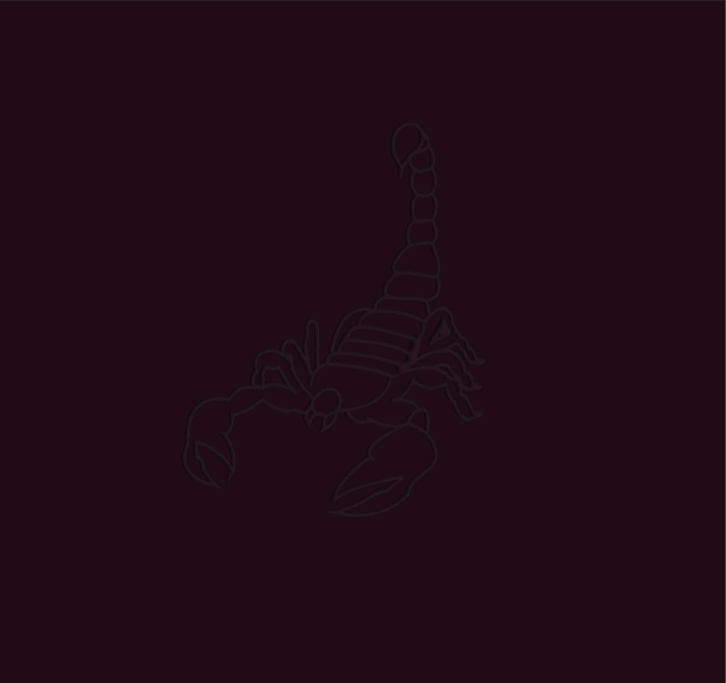
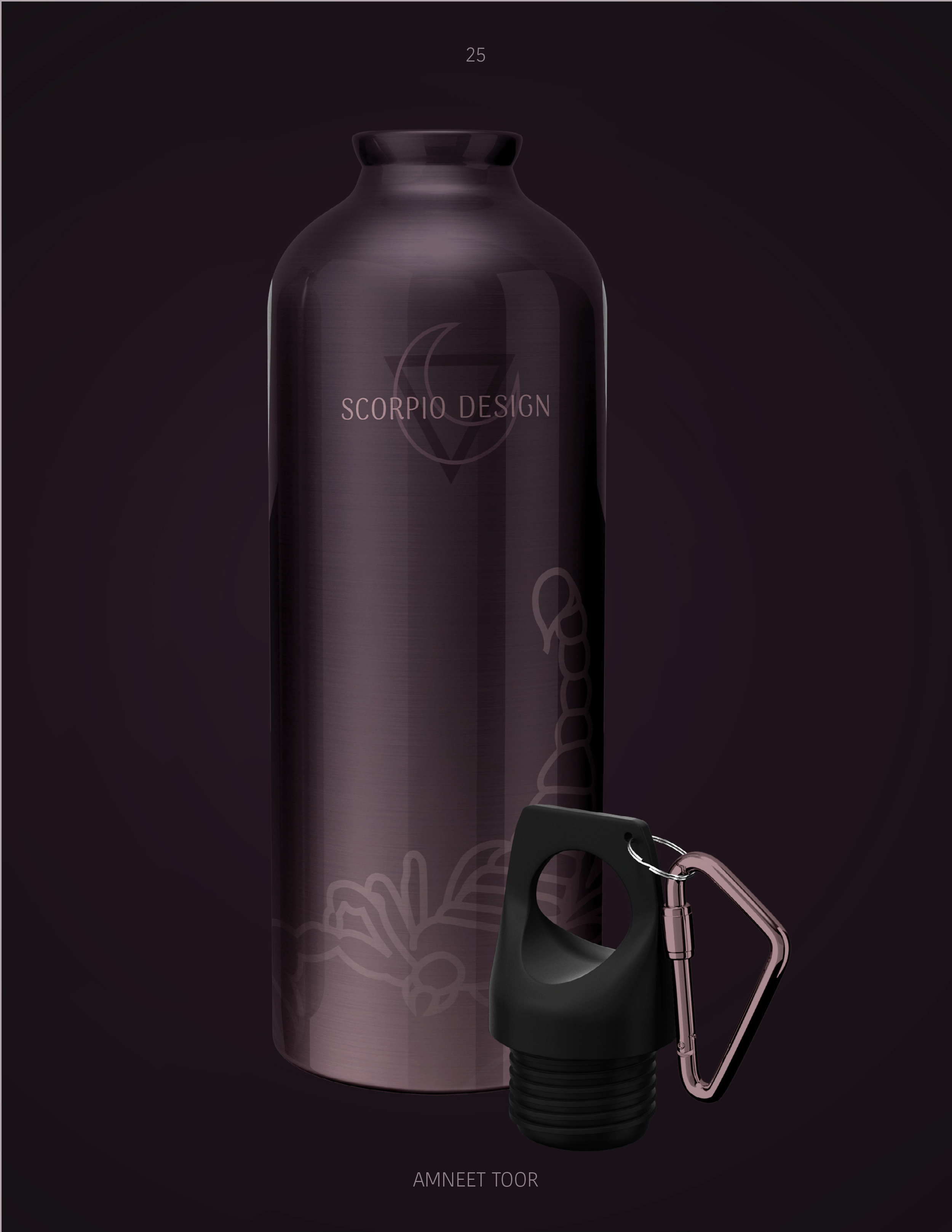
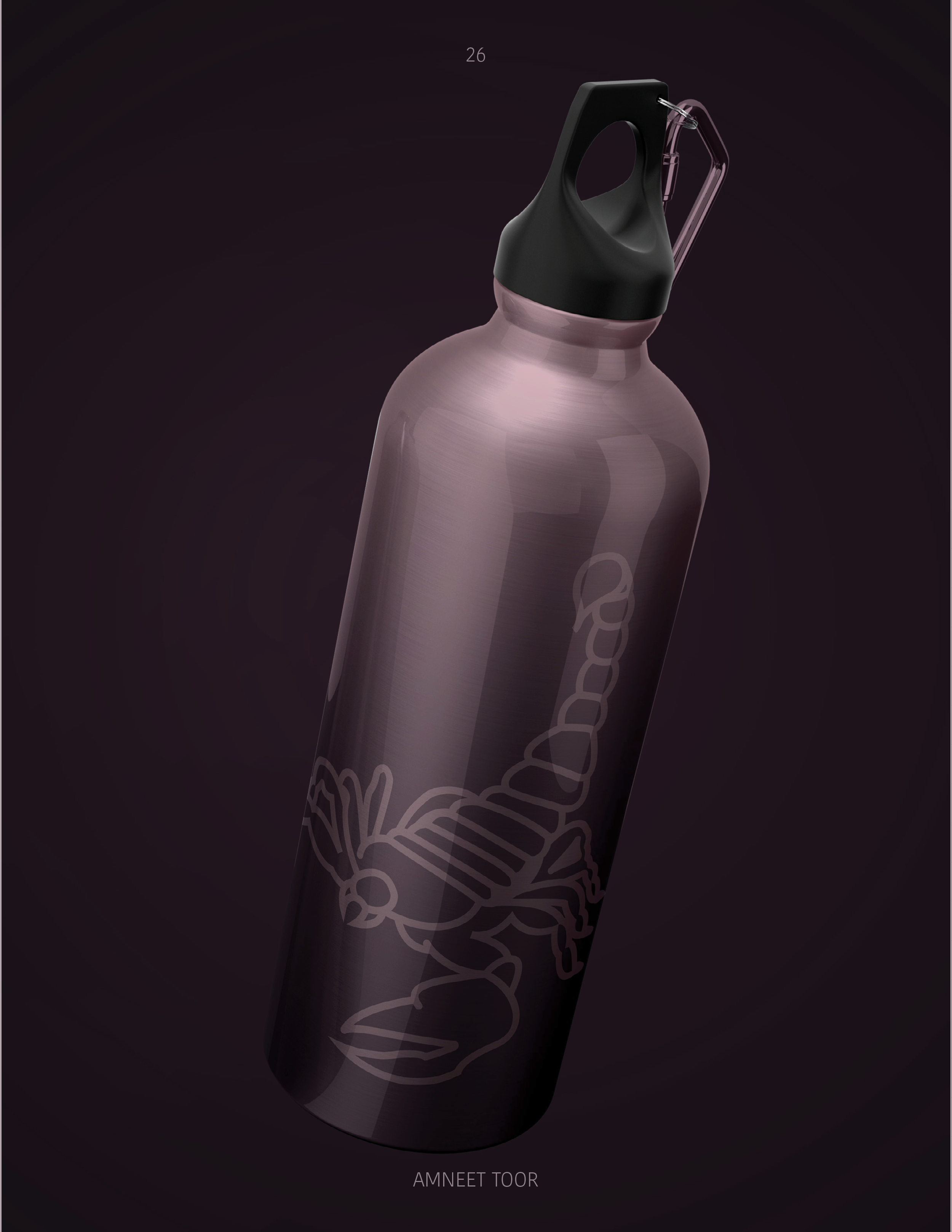
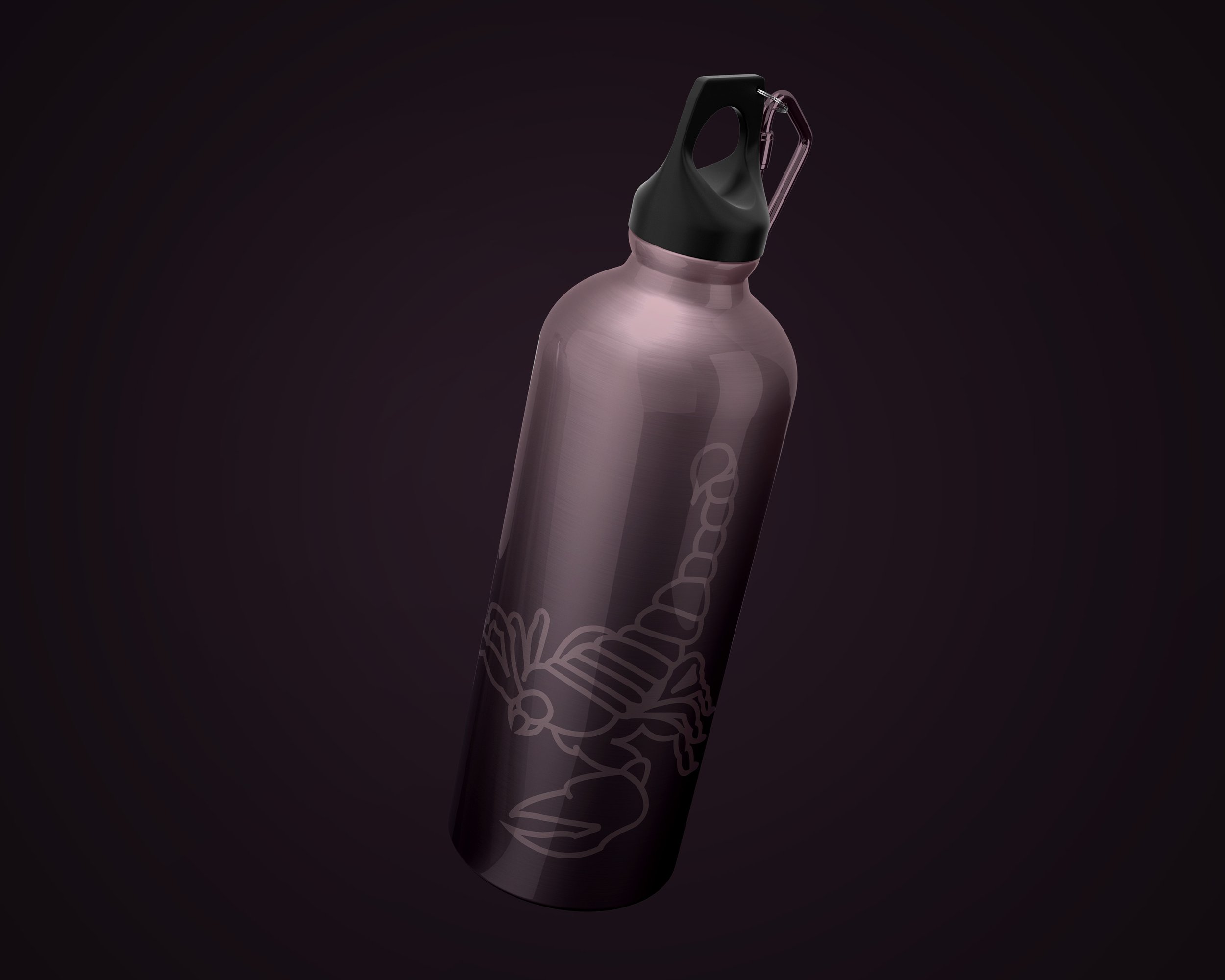
The scorpion itself plays a key role in the branding. More than just a literal reference to the zodiac, it brings a sense of boldness and identity — a visual anchor that ties everything back to the powerful energy of Scorpius.
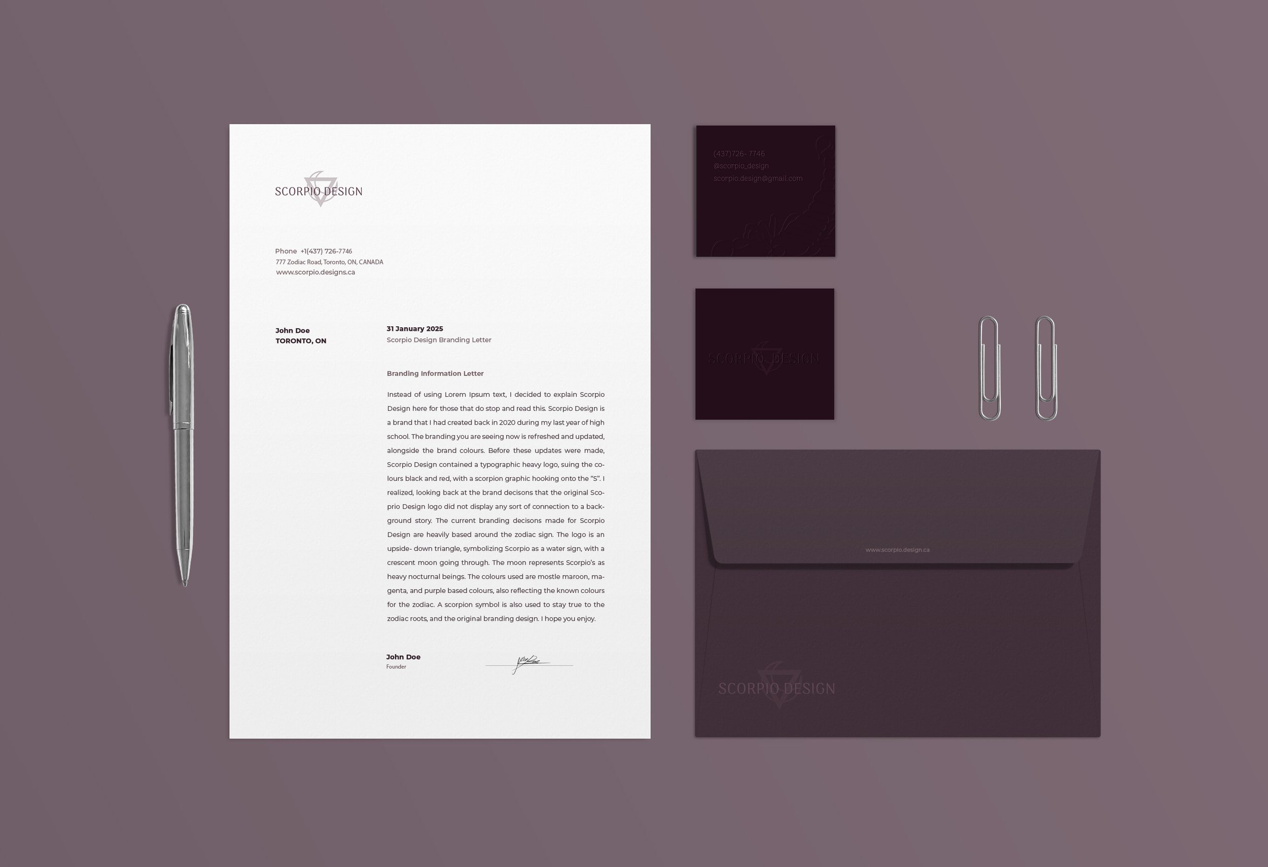
STATIONARY —
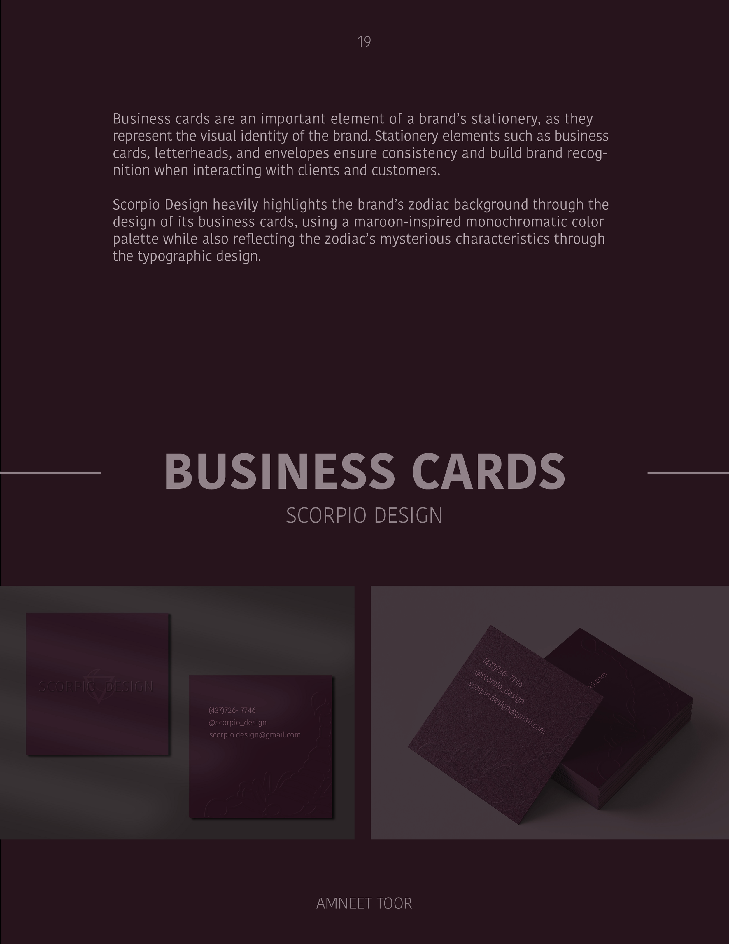
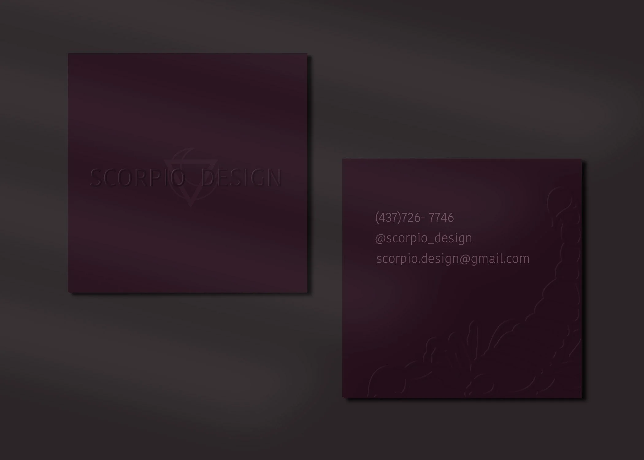
Business Cards

Built for impact and memorability, these cards were designed to leave a lasting first impression — aligning personal identity with a powerful visual brand.
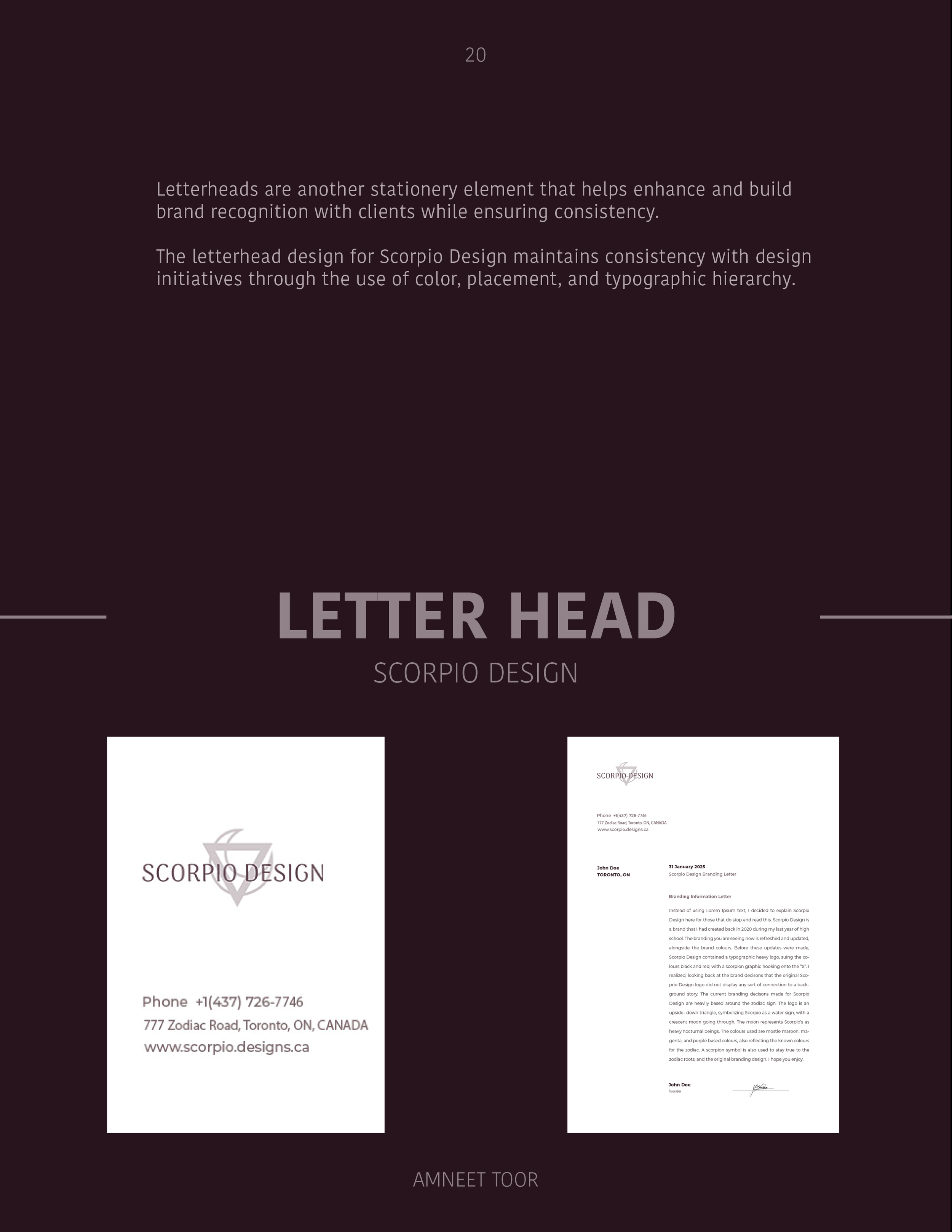
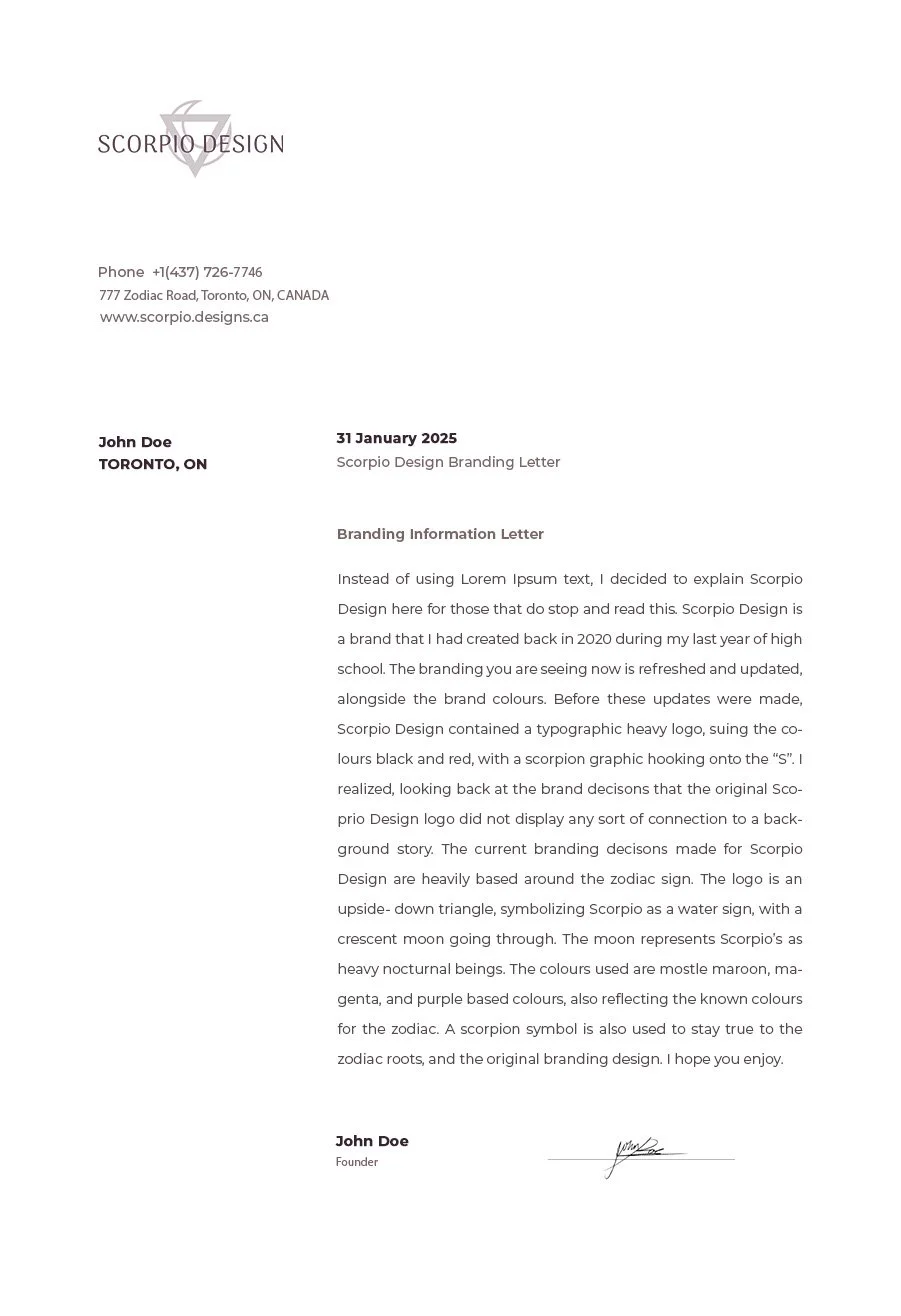
Letterhead
Structured for confidence, the letterhead design incorporates clear hierarchy, generous spacing, and brand-aligned typography to ensure legibility while reinforcing Scorpio Design’s magnetic and professional tone.
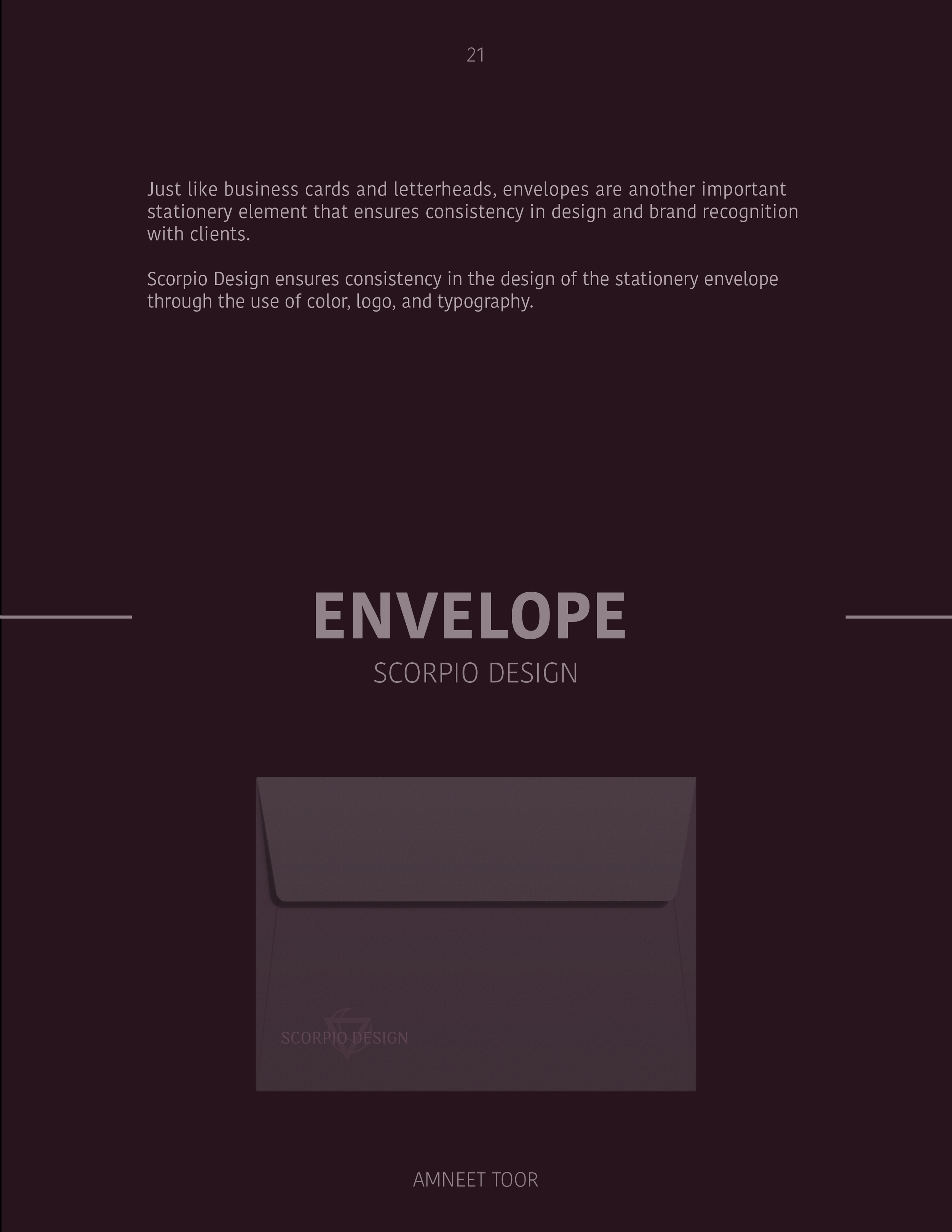
Envelope
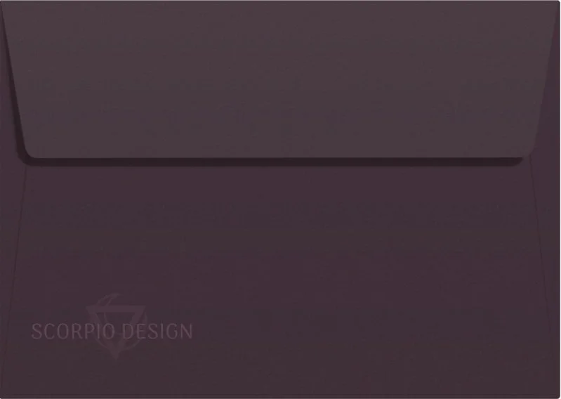
Designed with subtle embossing and a centered logo, the envelope reflects the brand’s mysterious identity while offering a clean, elevated touchpoint that aligns with the project’s nocturnal-inspired colour palette.
DIGITAL- FIRST CONTEXTS —
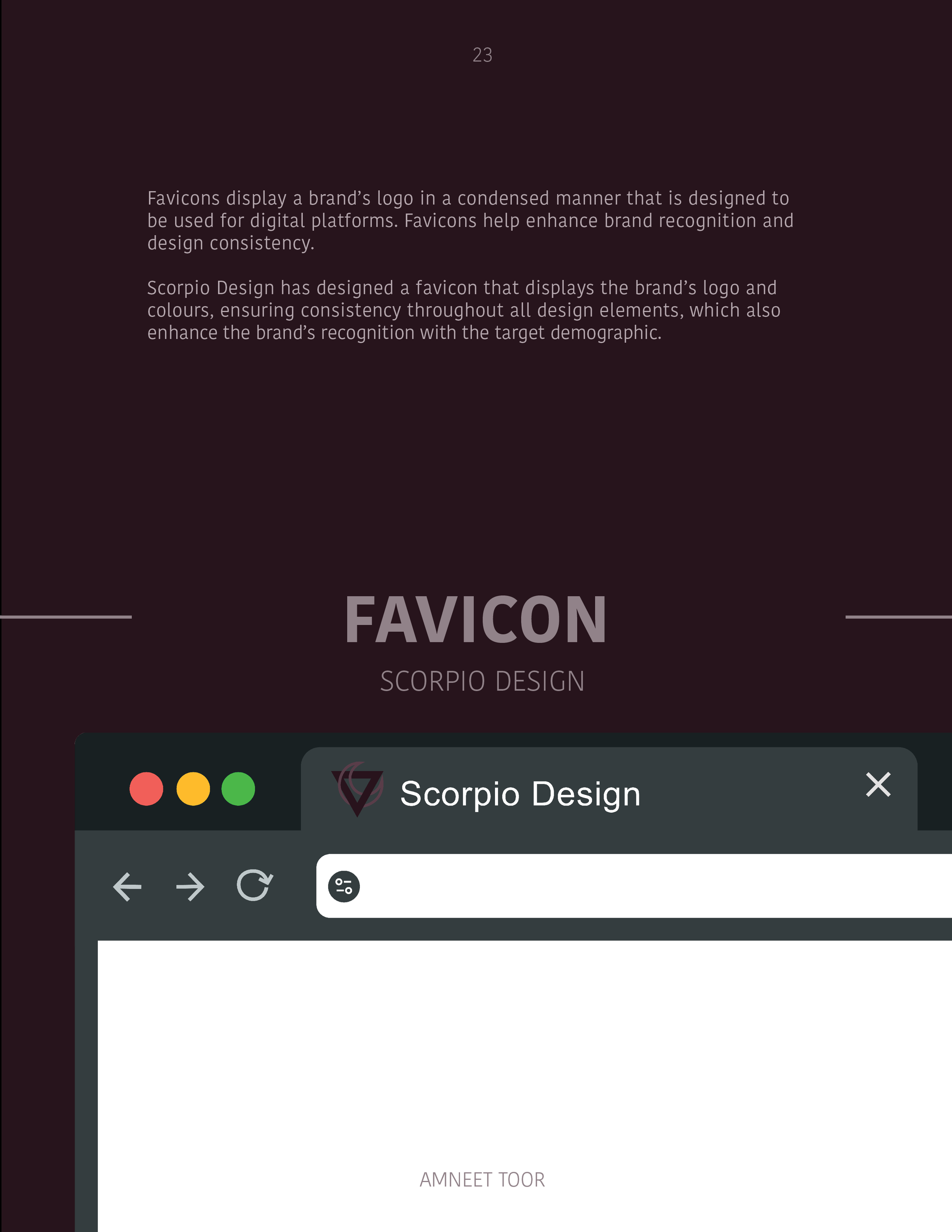
Favicon
Landing Page
For Scorpio Design, I created a favicon that draws directly from the brand’s logo and color palette. My goal was to make sure that even in the smallest digital touchpoint, the brand feels instantly recognizable and cohesive. This tiny but crucial detail reinforces the brand’s presence across browsers and devices, supporting the overall identity system.

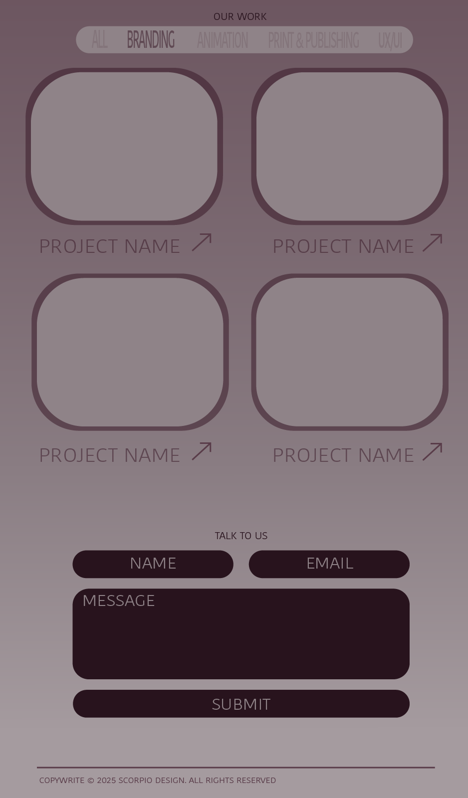
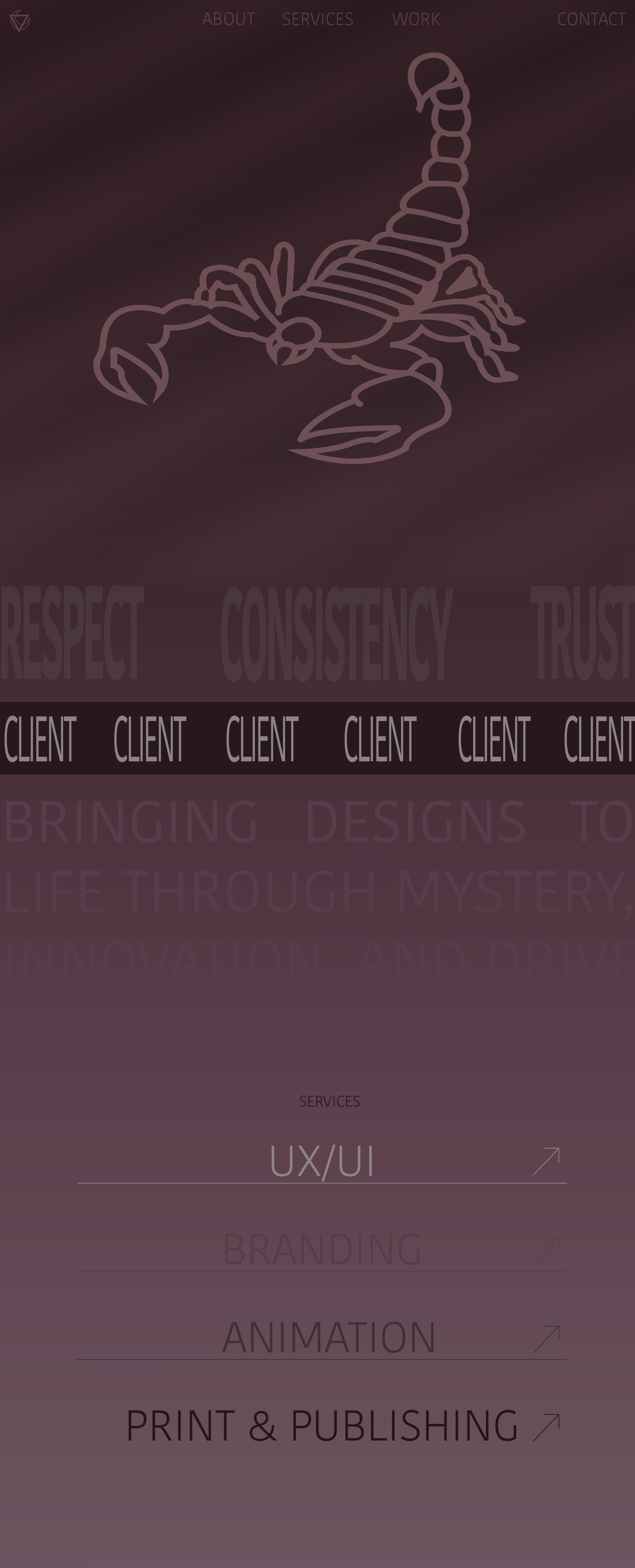
The landing page for Scorpio Design was created to stay fully consistent with the brand’s visual identity, using only its established colour palette and typefaces. Iconography and opacity treatments were carefully designed to reflect the brand’s mysterious theme, drawing inspiration from the characteristics of the Scorpio zodiac sign.
In addition to the visual system, the layout and placement decisions were intentionally minimal and straightforward, allowing the design to feel clear and focused while still carrying the depth and intrigue associated with Scorpio. This balance between simplicity and mystery allows the landing page to feel both modern and true to the brand roots.
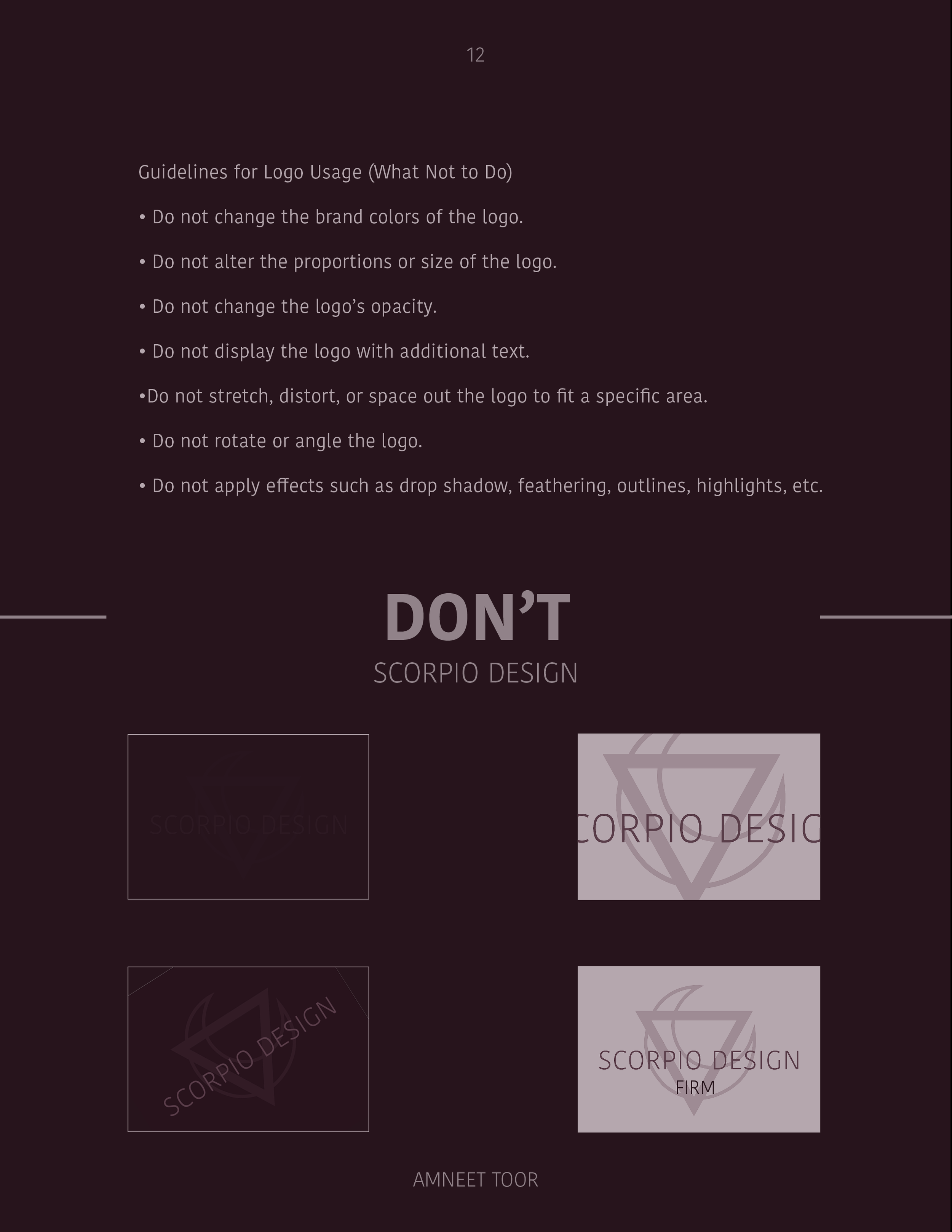
BRAND GUIDELINES

This project taught me how to distill complex brand traits like mood, energy, and symbolism, into small-format designs that still feel intentional, memorable, and emotionally resonant.
