
Typography on the Streets
• Graphic Design
• Typographic Design
• Photography
PRODUCT DELIVERABLES
• Copywriting
• Cover Design
2022
• Illustrator
• Photoshop
• InDesign
PRODUCT TOOLS
My Role
• Concept Development
• Typographic Research
• Layout and Design
• Copywriting and Editing
• Photography
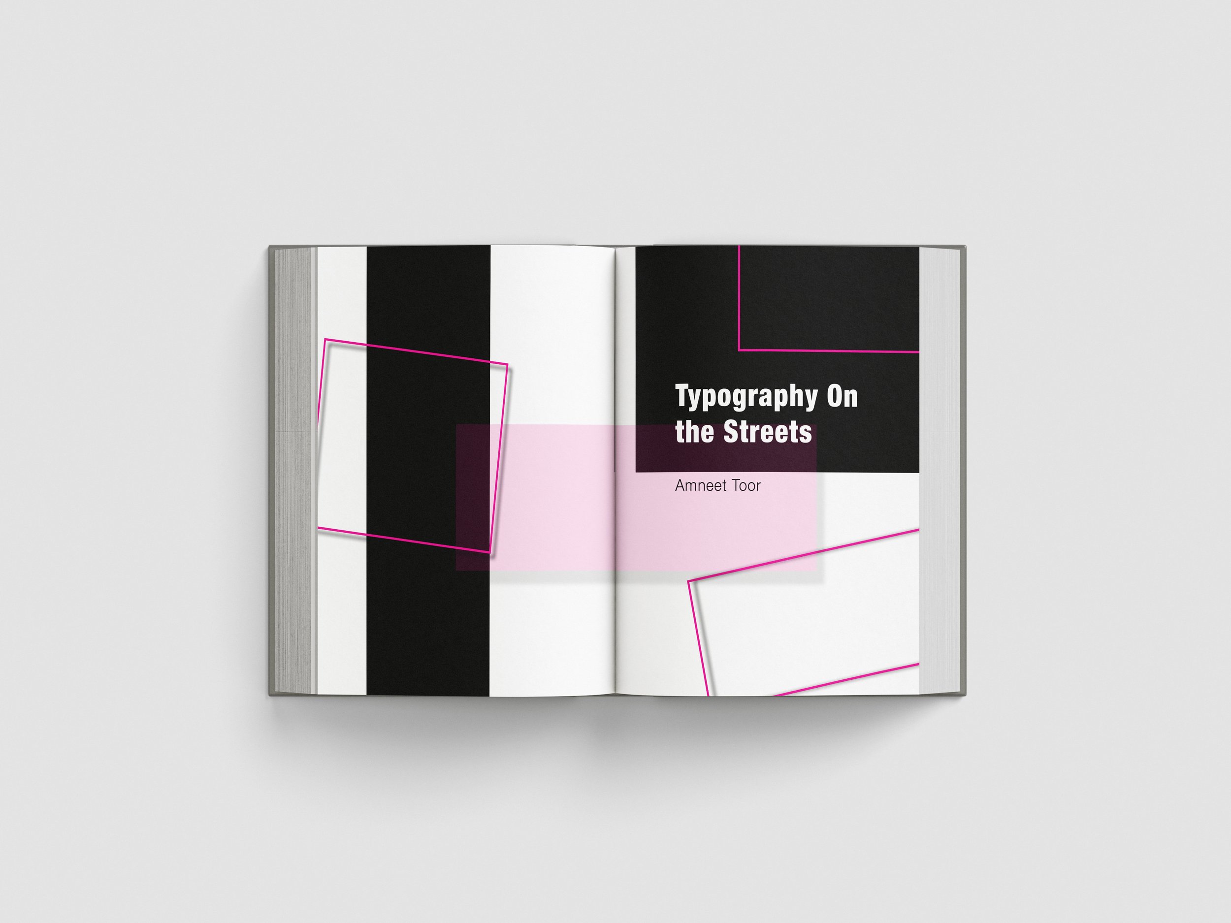
Typography on the Streets looks at the kind of type we pass by every day—painted signs, old shop lettering, graffiti tucked behind corners—things that feel ordinary at first glance. Using Carl Dair’s seven contrasts as a lens, the book breaks down how these styles work, what they say, and why they matter. It’s designed as an easy, thoughtful starting point for designers who want to understand type not just as design, but as something living in the world around them.
Typography on the Streets was designed for junior designers and typography students as a guide on typographic structures, and how they function in the real world. It can also be used as a workshop or branding tool to reintroduce designers to type in spaces.
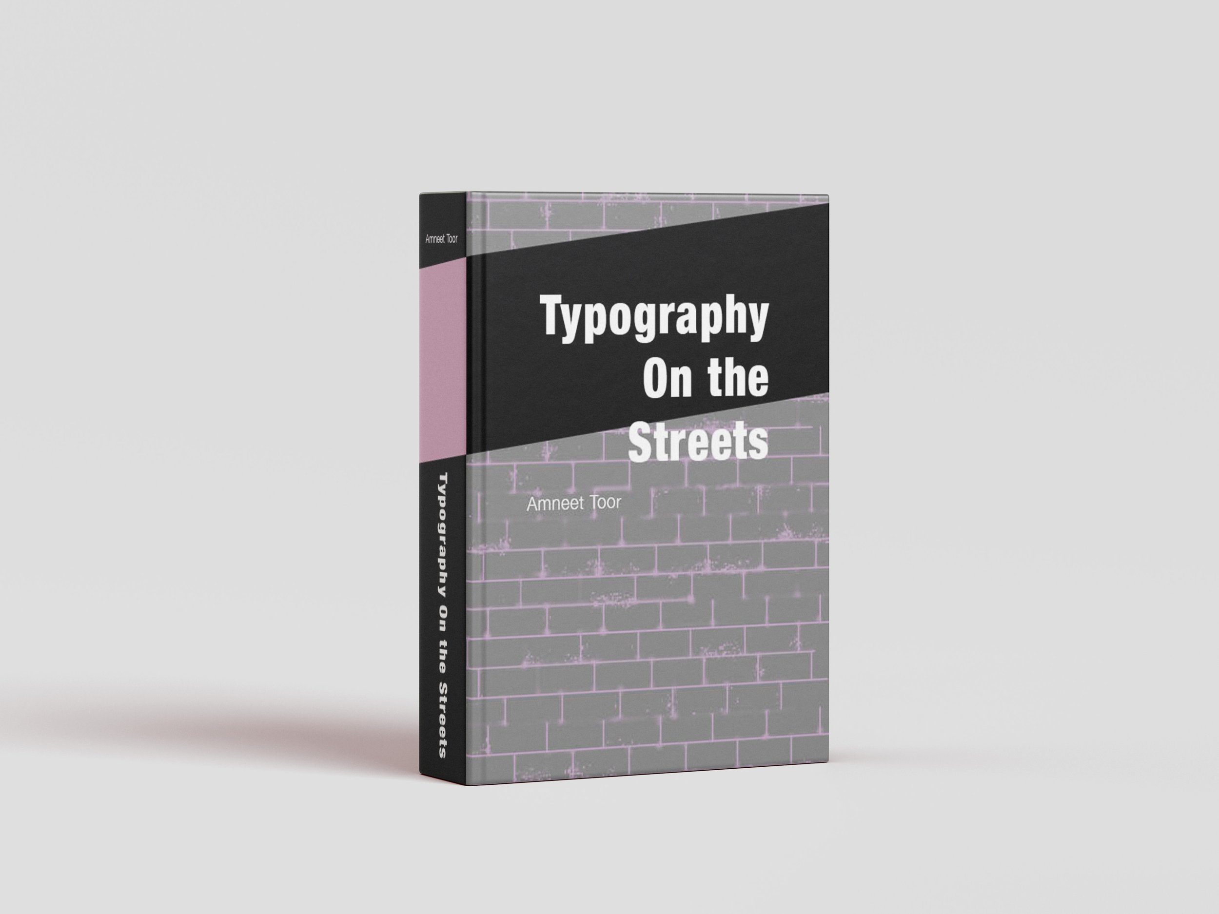
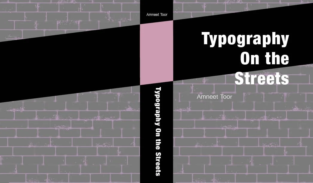
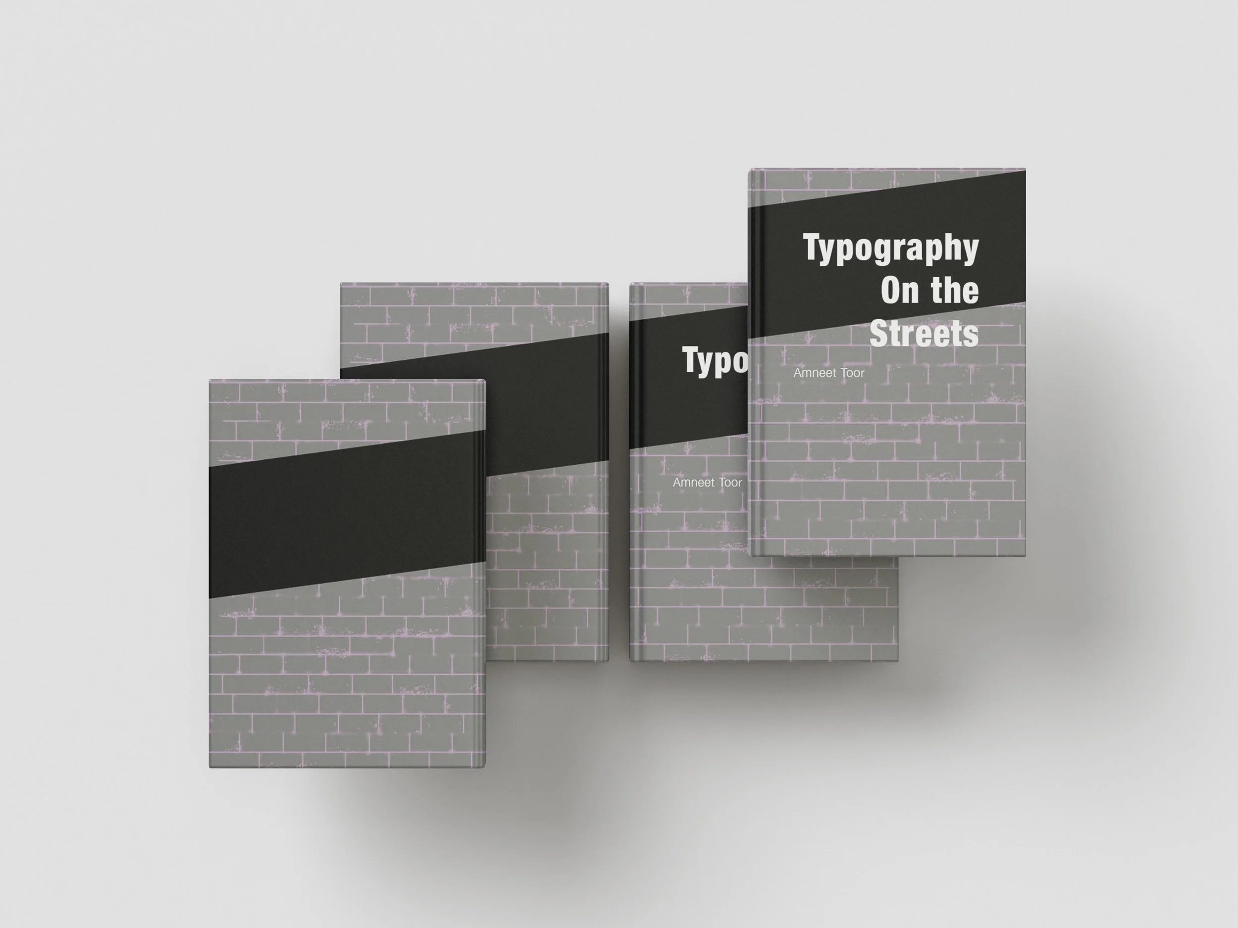
The cover of Typography on the Streets features a painted brick wall with splashes of pink graffiti, evoking the raw energy of urban environments. The brick wall acts as a familiar backdrop seen in cities across the globe—spaces where typography naturally appears through street signs, graffiti, and everyday advertising. A bold black and pink strip runs across both the front and back covers, visually linking the exterior to design elements found throughout the book’s interior.
INTERIOR PAGES
-
![]()
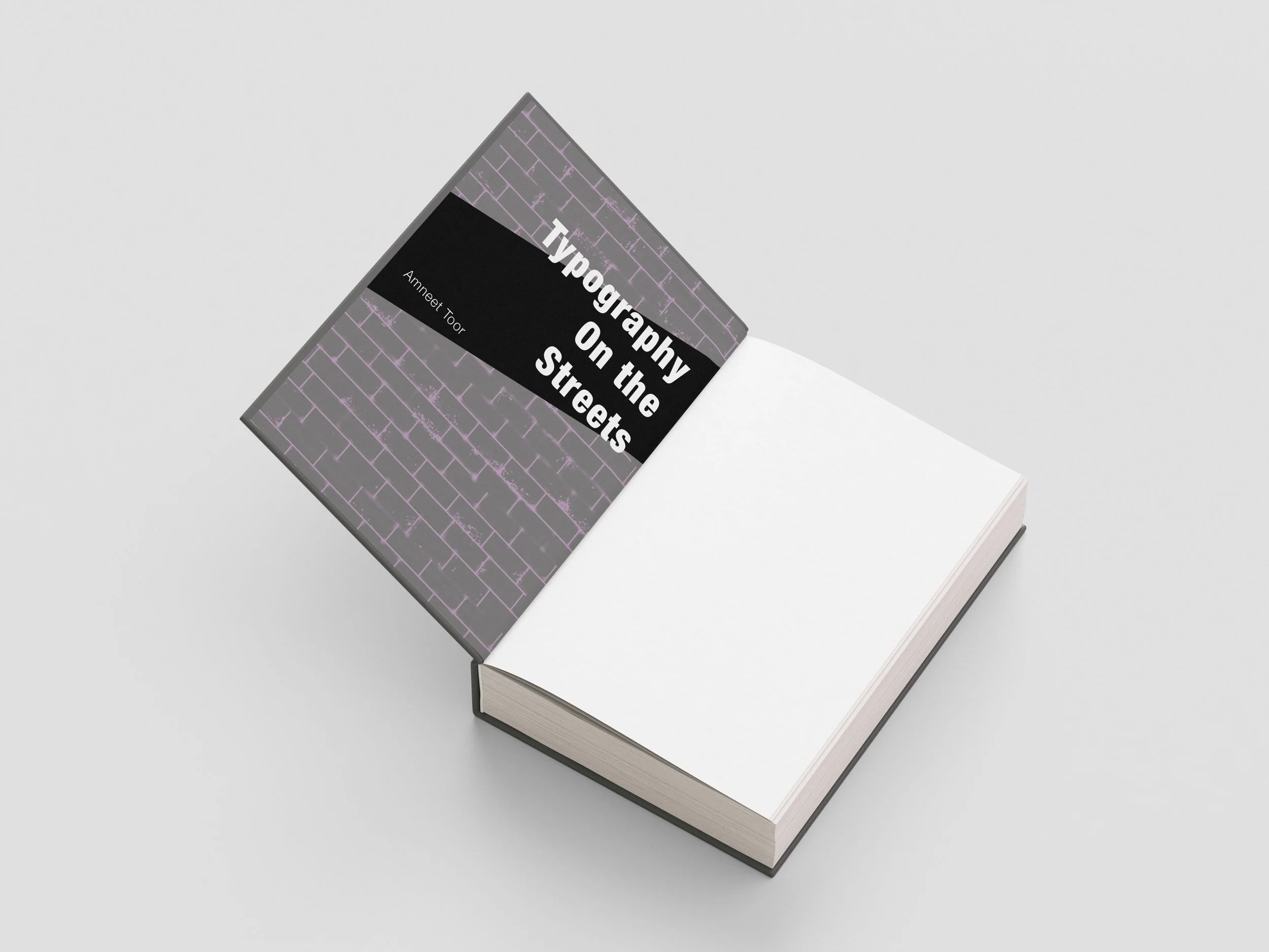
Inner Cover
-
![]()
Half- Title Page
-
![]()
Table Of Contents
-
![]()
Preface
-
![]()
Chapter 1 Start
-
![]()
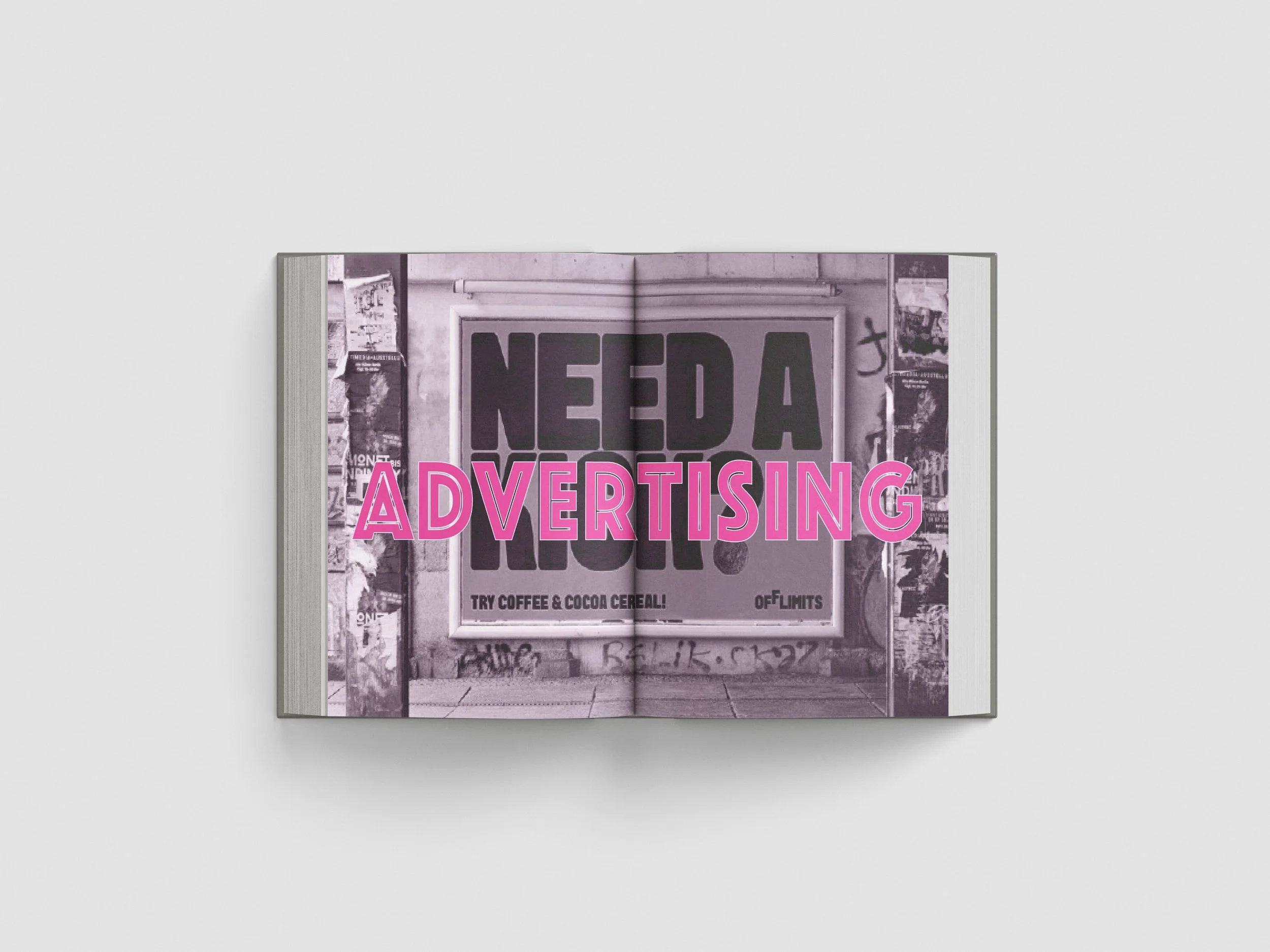
Advertising Page
-
![]()
Advertising Page
-
![]()
Advertising Page
-
![]()
Chapter 2
-
![]()
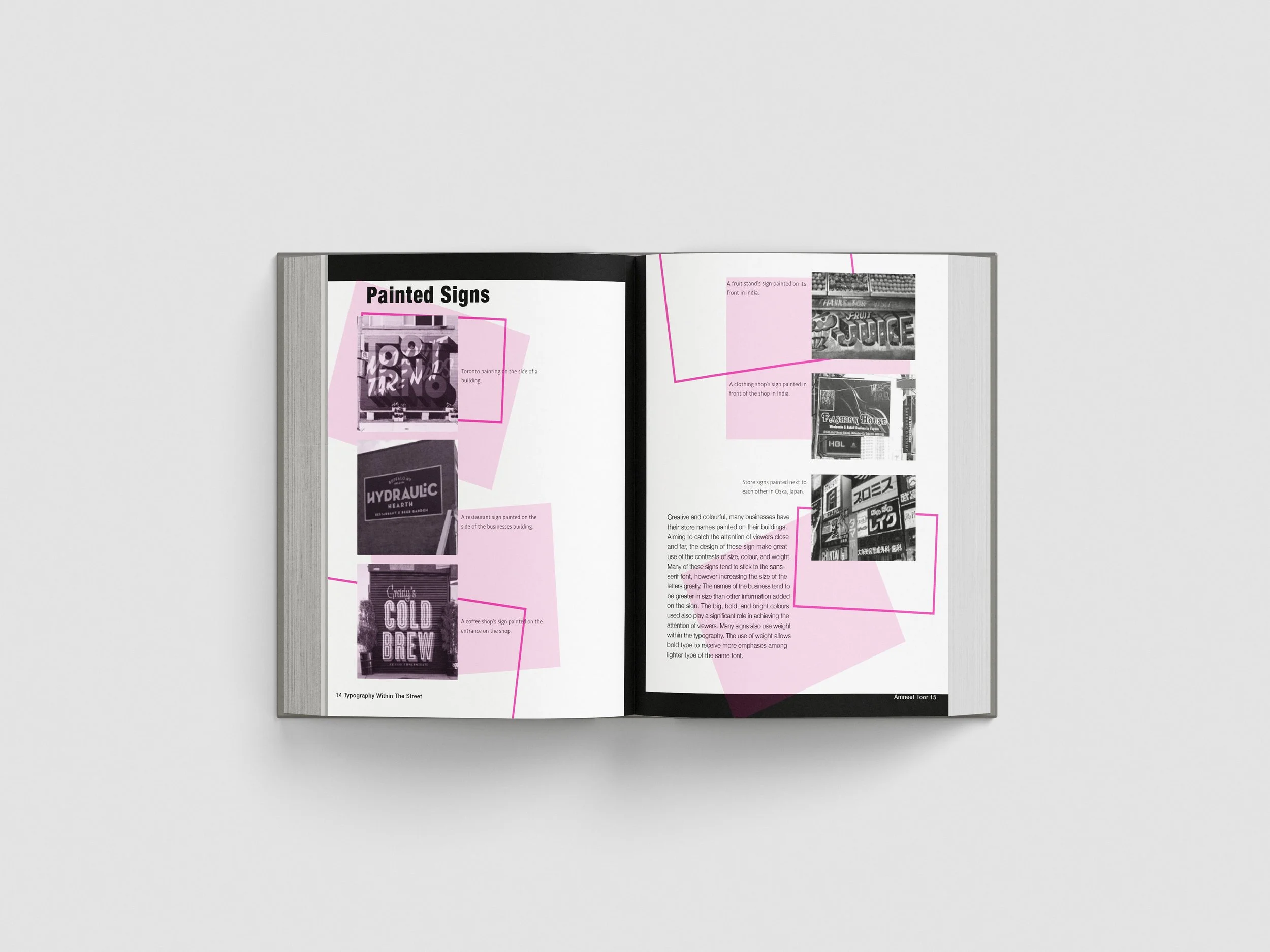
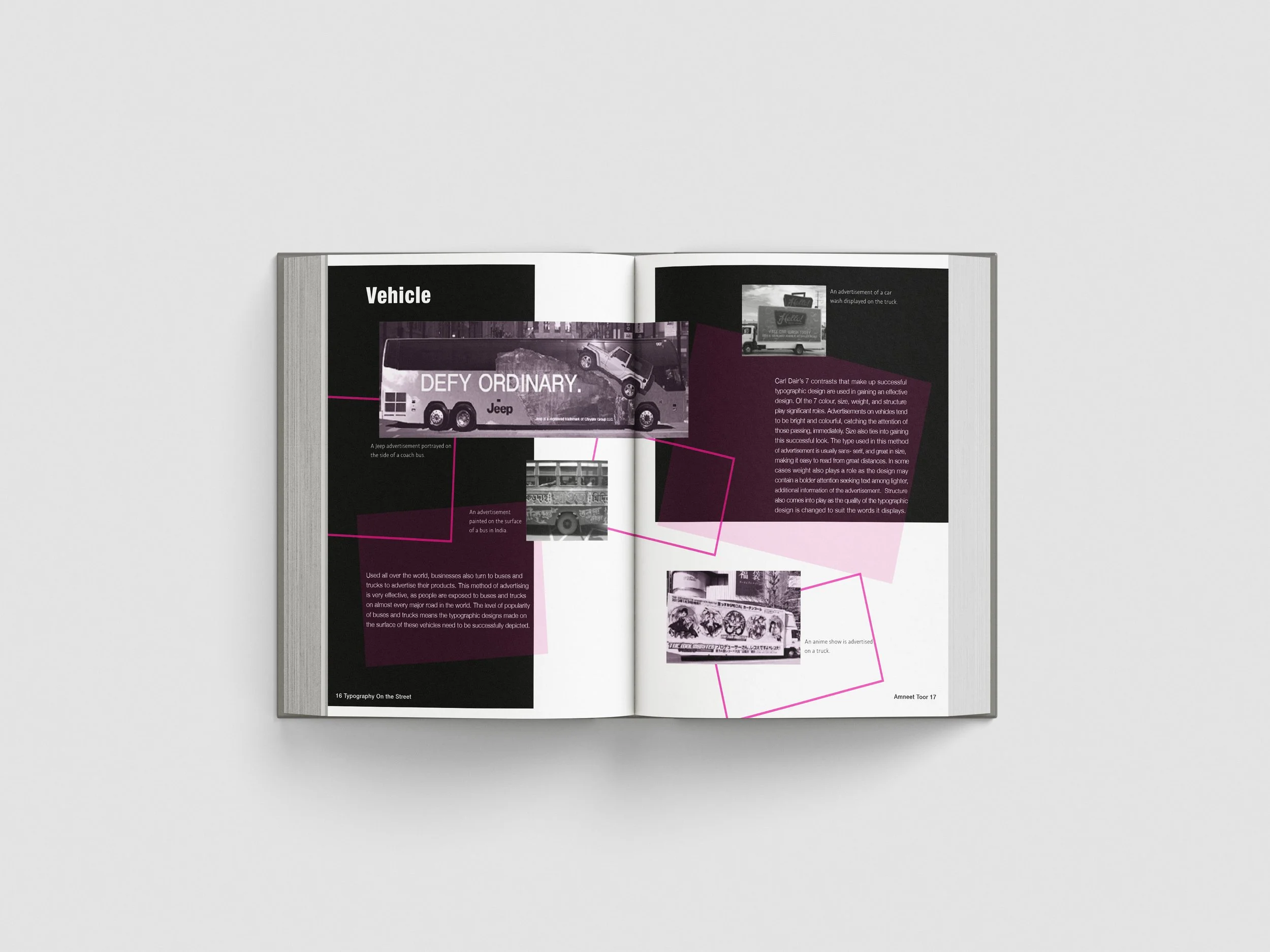
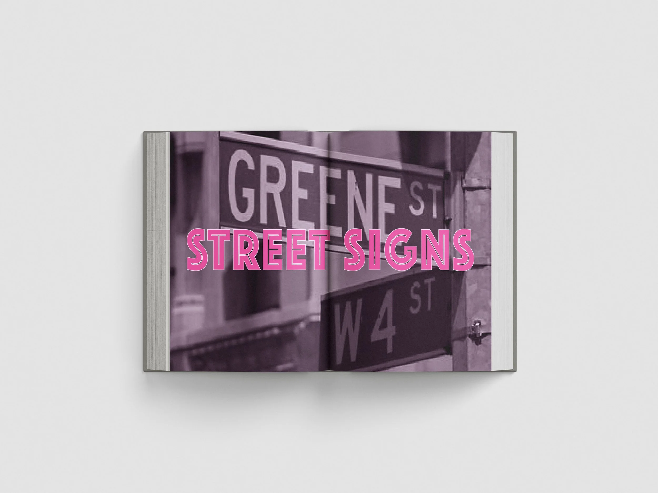
Street Sign Page
-
![]()
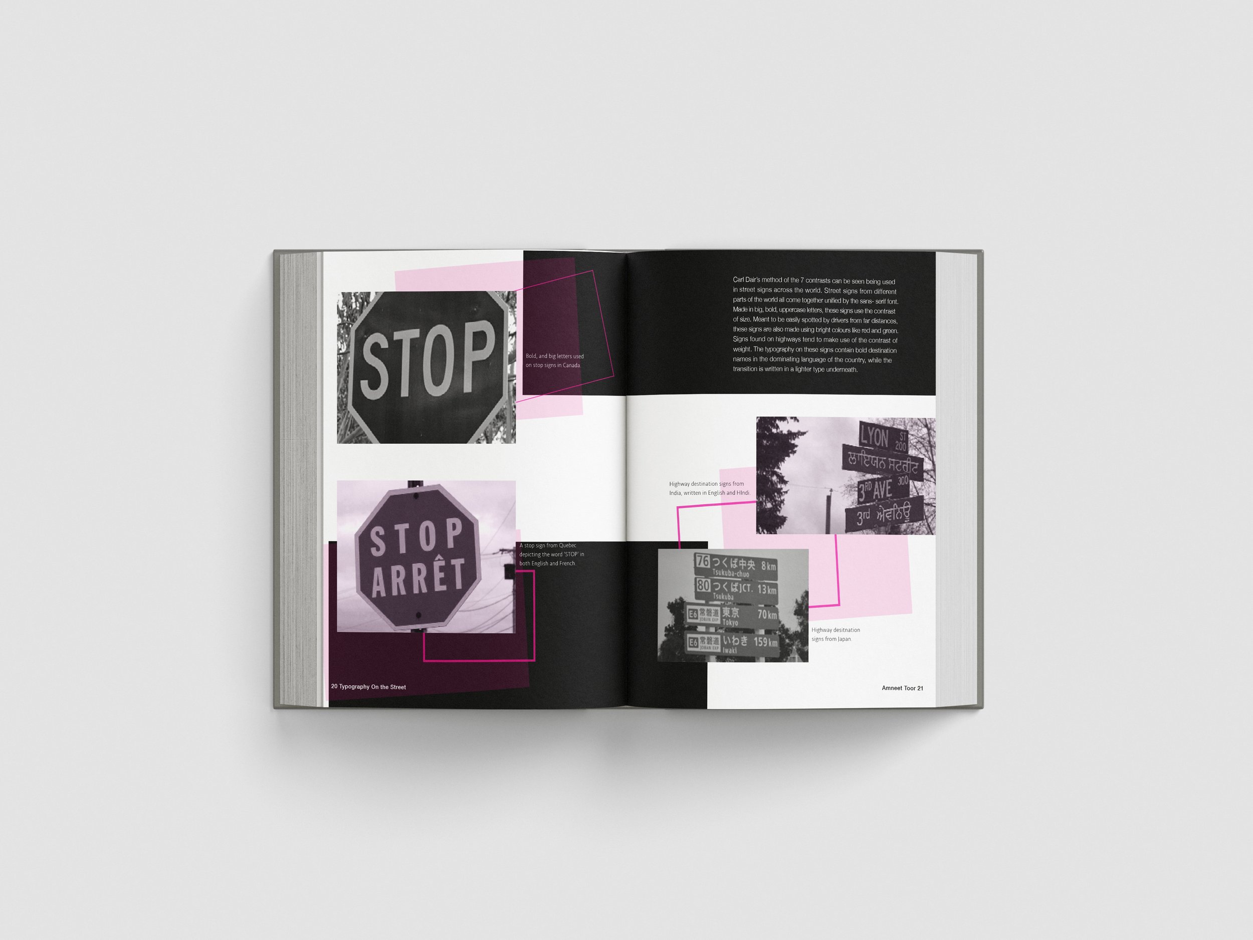
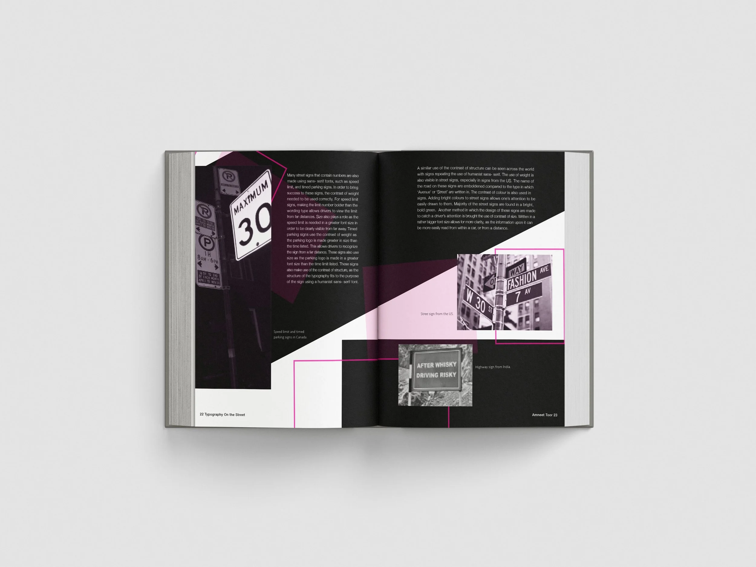
Street Sign Page
-
![]()
Chapter 3
-
![]()
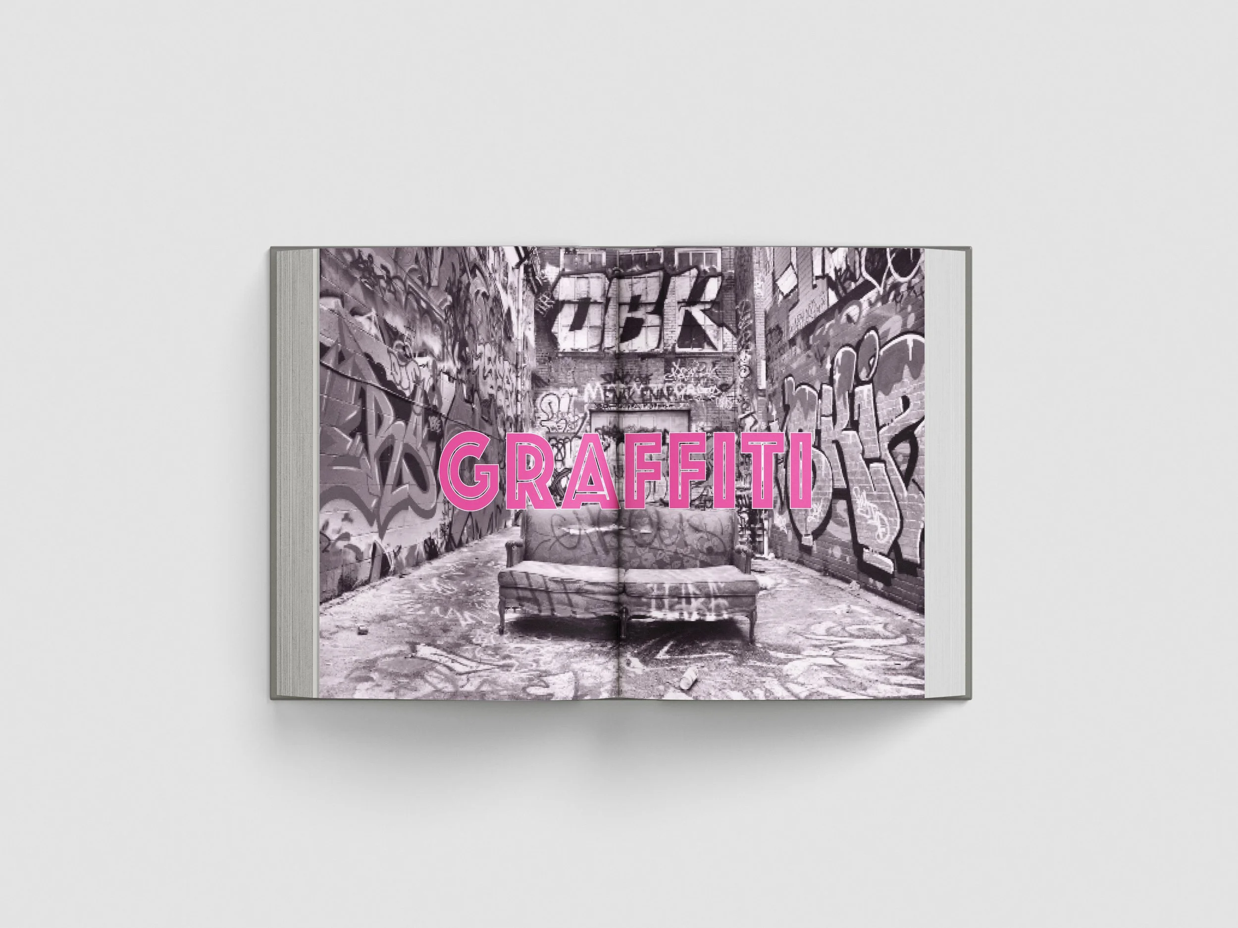
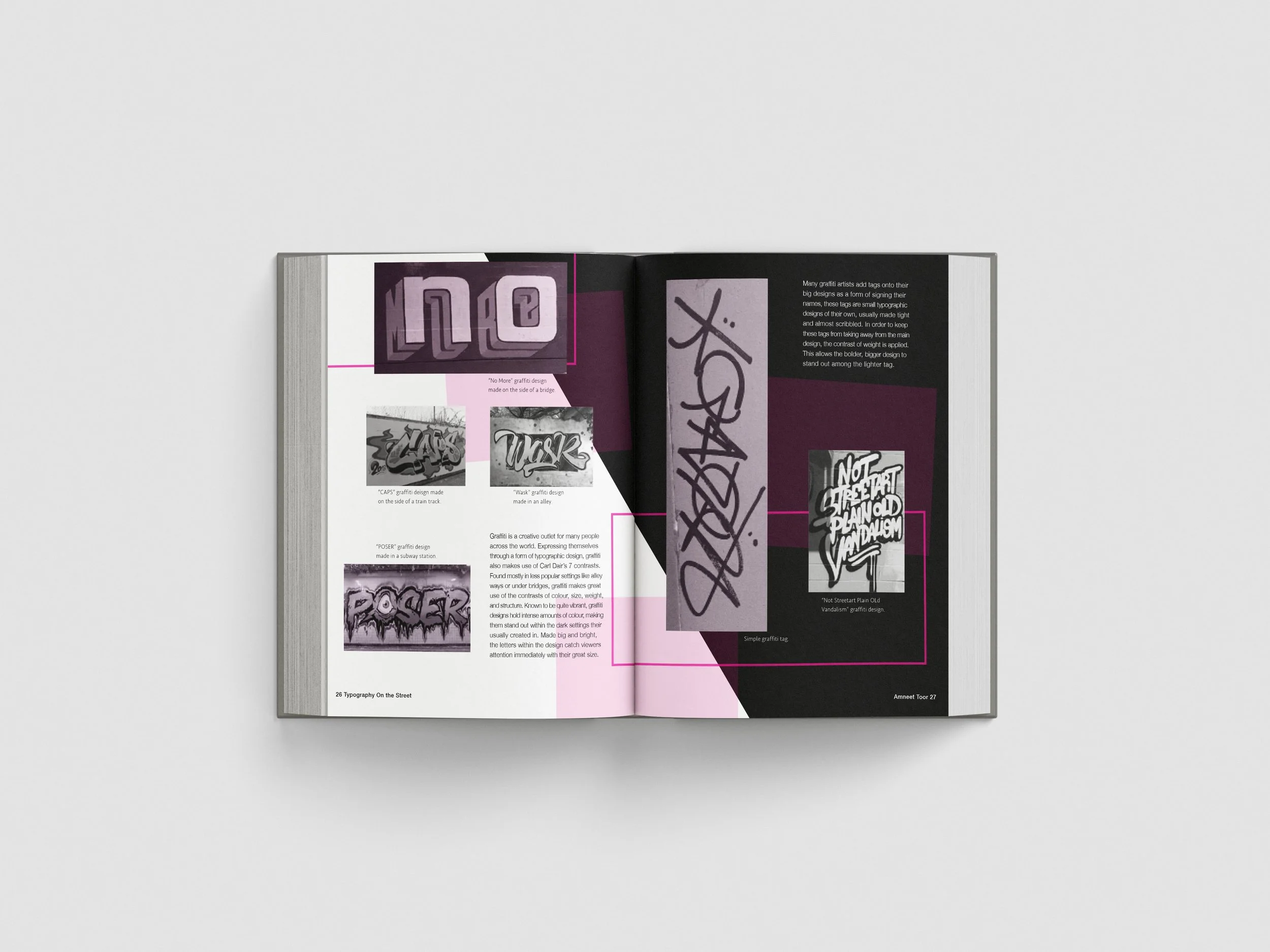
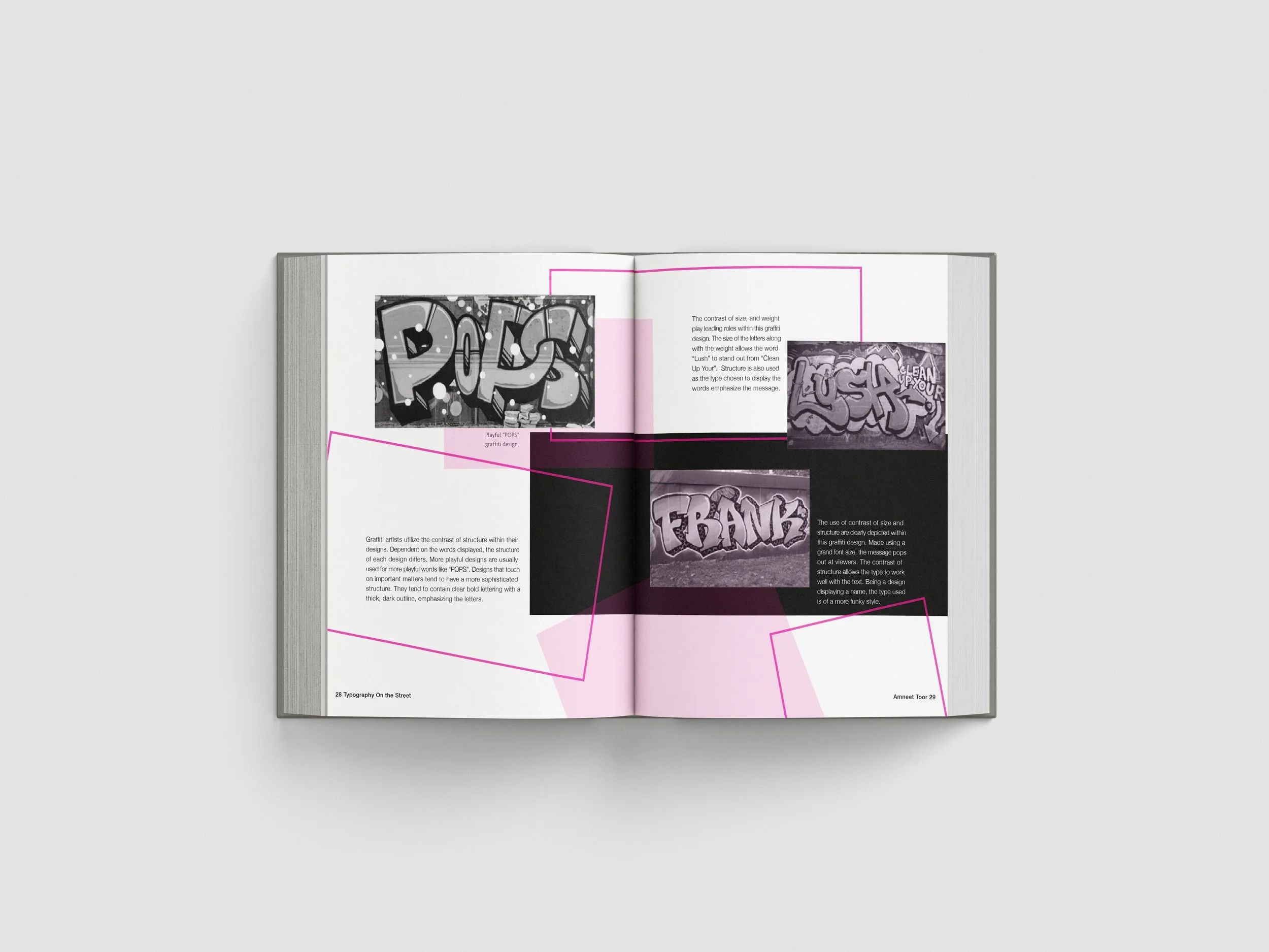
Graffiti Page
-
![]()
Graffiti Page
-
![]()
Credits Page
-
![]()
Free Endpaper


This project helped me explore how design connects with culture and the spaces we move through — a lens I bring into every brand I work with.